Get The Flock Out (2024)
Get The Flock Out is a 2.5D puzzle maze game my team and I developed during an Ignite Jam session between November and December of 2024. Our game follows a shepherd named Maeve and her sheep who get lost in an underground maze and must work together to get out by solving puzzles and collecting keys.
I worked on this game as a 2D Artist and Animator responsible for developing the visuals for the game's UI Design. This included the official game logo, typography, and other 2D assets included throughout the game. I also worked on creating some limited animation assets that were featured in our game's gameplay trailer. As a new responsibility, I also worked on the character design for both the shepherd and her sheep.
Our game won an award for Best Music at the end of the Ignite Jam session.
Link to game prototype: https://bhargav-rama-krishna.itch.io/get-the-flocks-out
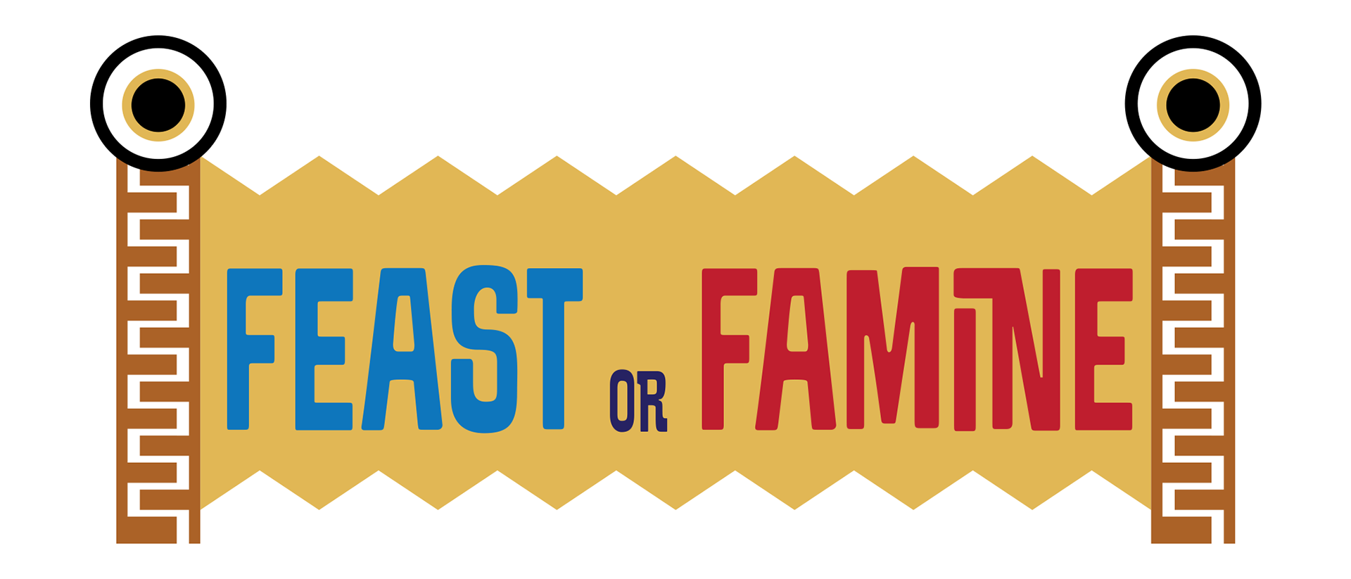
Official Game Logo
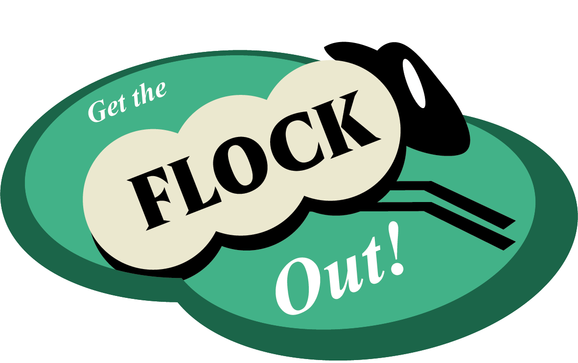
This is the official game logo I designed for our team's game. For the composition, I superimposed a sheep against an abstract green background with the text placed over it.
Main Character Designs
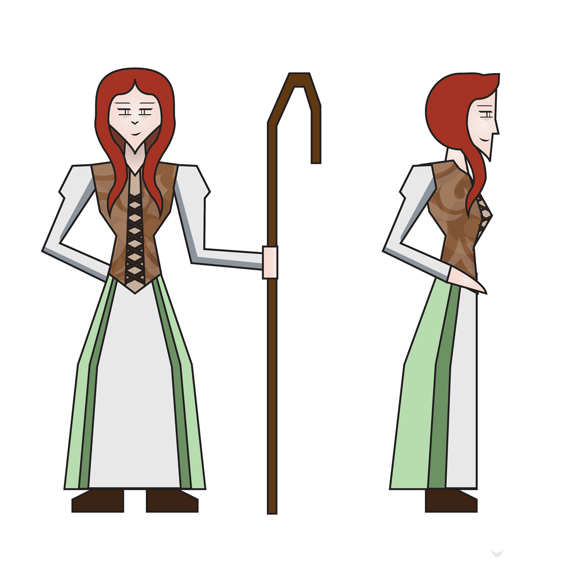
Maeve (Shepherd)
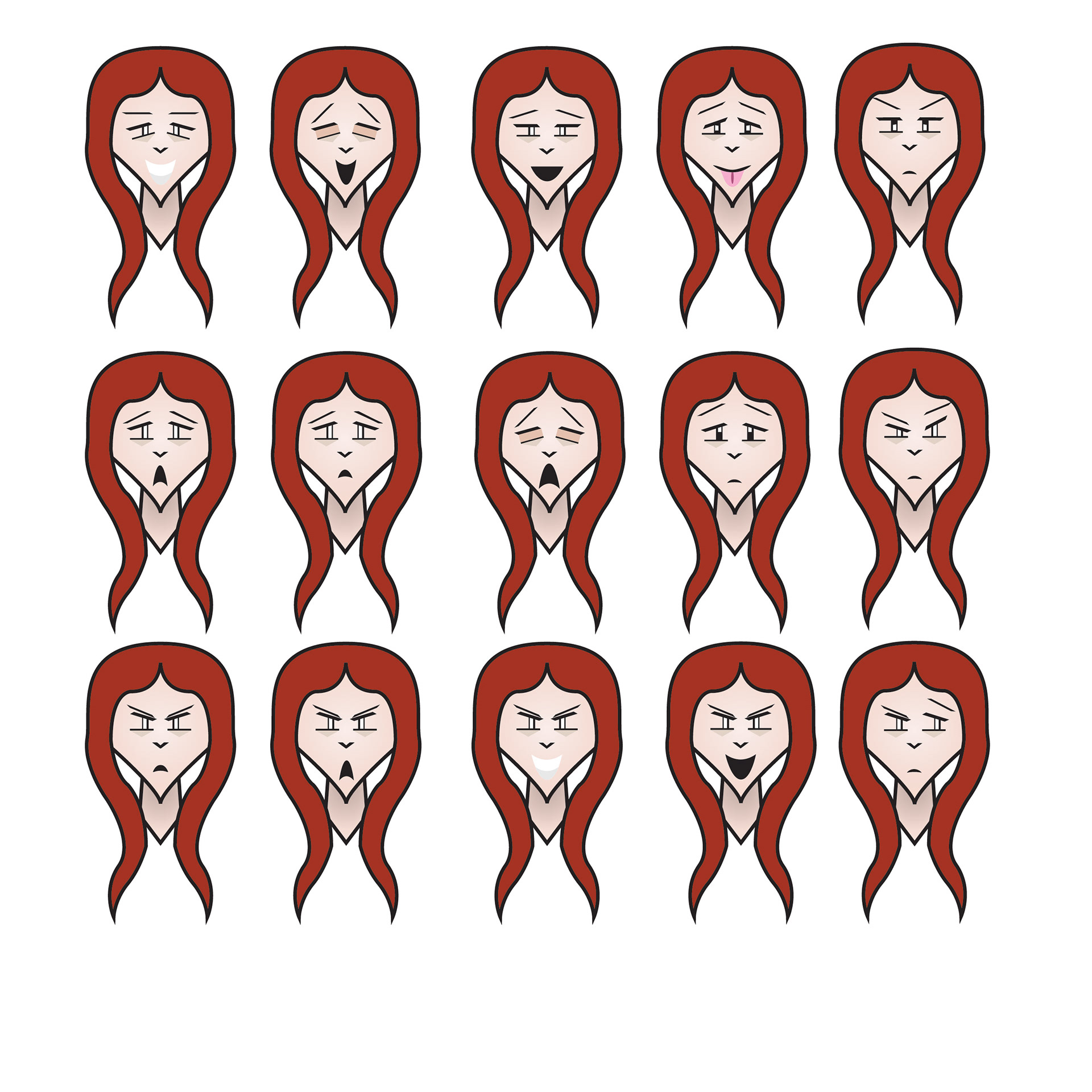
Maeve (Expressions)
This is the main design for Maeve, the main shepherd that the player controls in the game. On the left are full-body sketches of Maeve facing forwards and to the sides. On the right are various facial expressions I drew to showcase how Maeve would theoretically react to different situations. In-game animation sprites done by Miguel Sanchez.
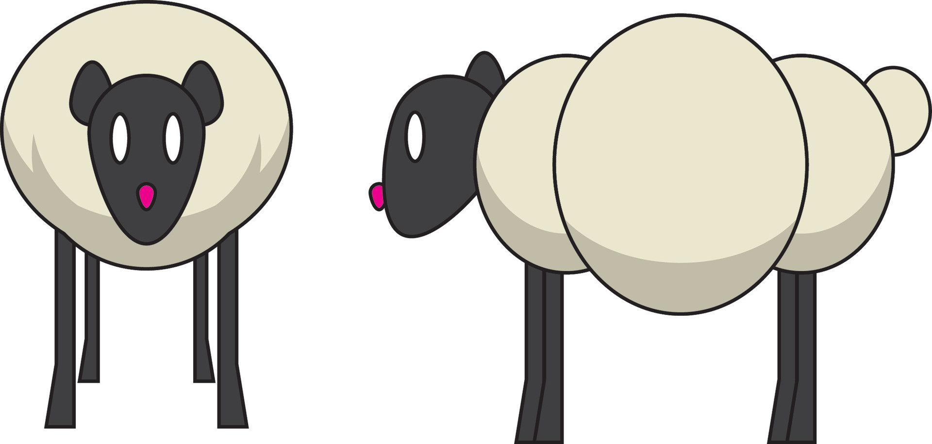
This is the main design for the sheep that the player can also play as in the game. The actual design in-game is slightly simplified to make animating character sprites easier. In-game animation sprites done by Miguel Sanchez.
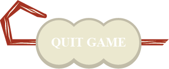
Menu Navigation Buttons


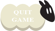


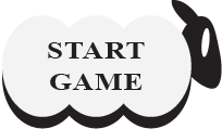


These are the main menu buttons, which I designed to look like sheep. The buttons in the left column are how the buttons would look when the player hovers over them with the mouse (note the darker color of wool and the way the sheep's head tilts to face the viewer). The buttons in the right column show how the buttons would look when idle.
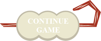


These are the pause menu buttons. Much like for the first batch of buttons, the buttons in the left column show how they would look when the player hovers over them with the mouse while the right column shows what they would look like when idle. For the overall design, while I reused the same wool colors to show the buttons in both hover and idle modes, I used a different overall design to differentiate them more from the main menu buttons. This new design features the sheep's wool on a shepherd's staff (the color of which remains the same in both hover and idle modes).


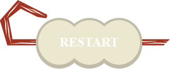
These are the end of level buttons. These follow the same style guidelines as incorporated for the pause menu buttons above (left column hover, right column idle).
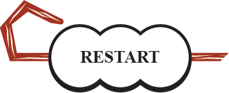
"Puzzle Complete" Icon
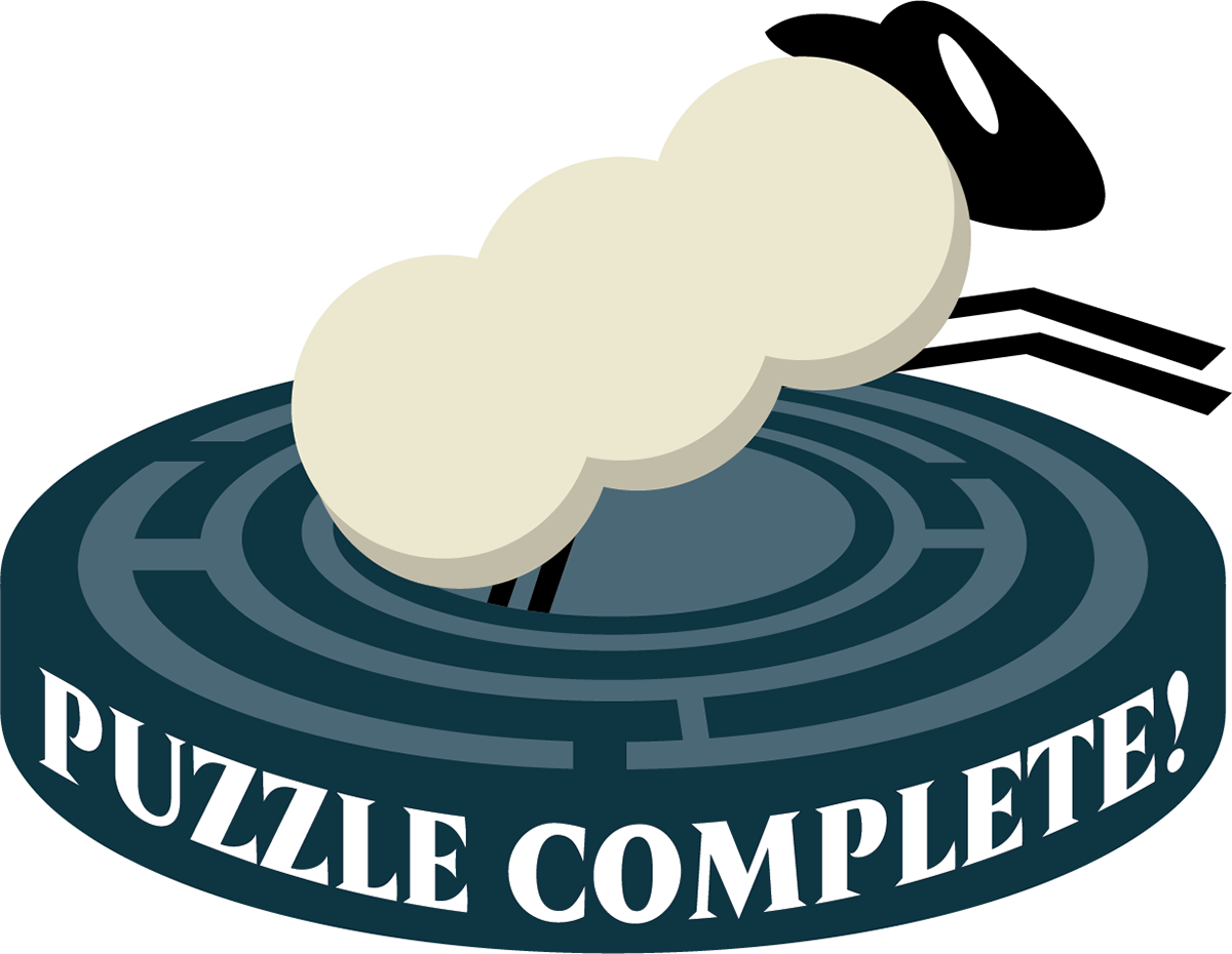
This was an end-of-level icon I made that would show up once the player completed a level in the game (not used during initial test-play during Ignite Jam session). The design was based on an earlier version of the official game logo design I had made that was ultimately not used, just slightly recolored with darker blue-green colors to match the aesthetic found in the menu splash art.
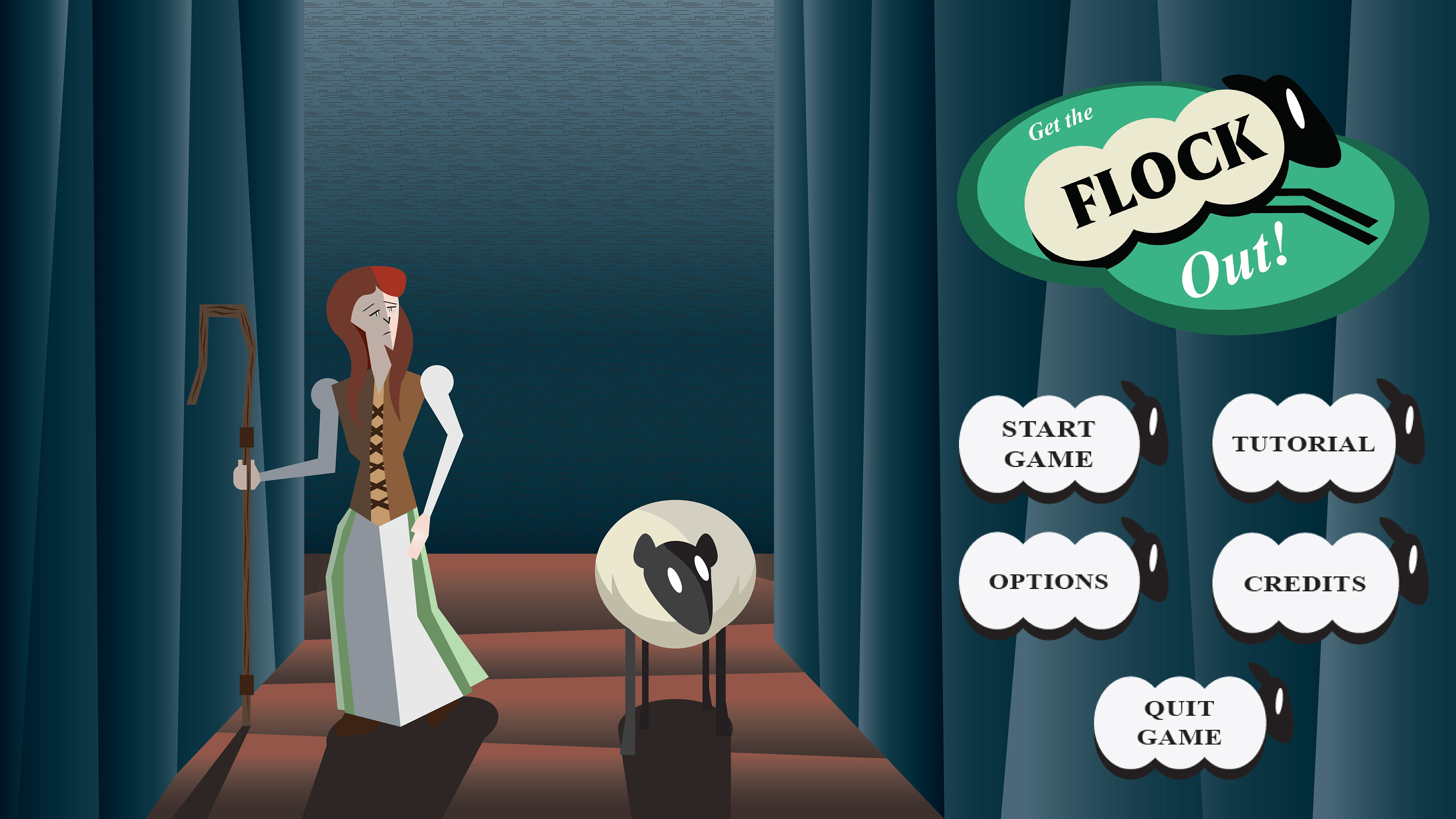
Menu Splash Art
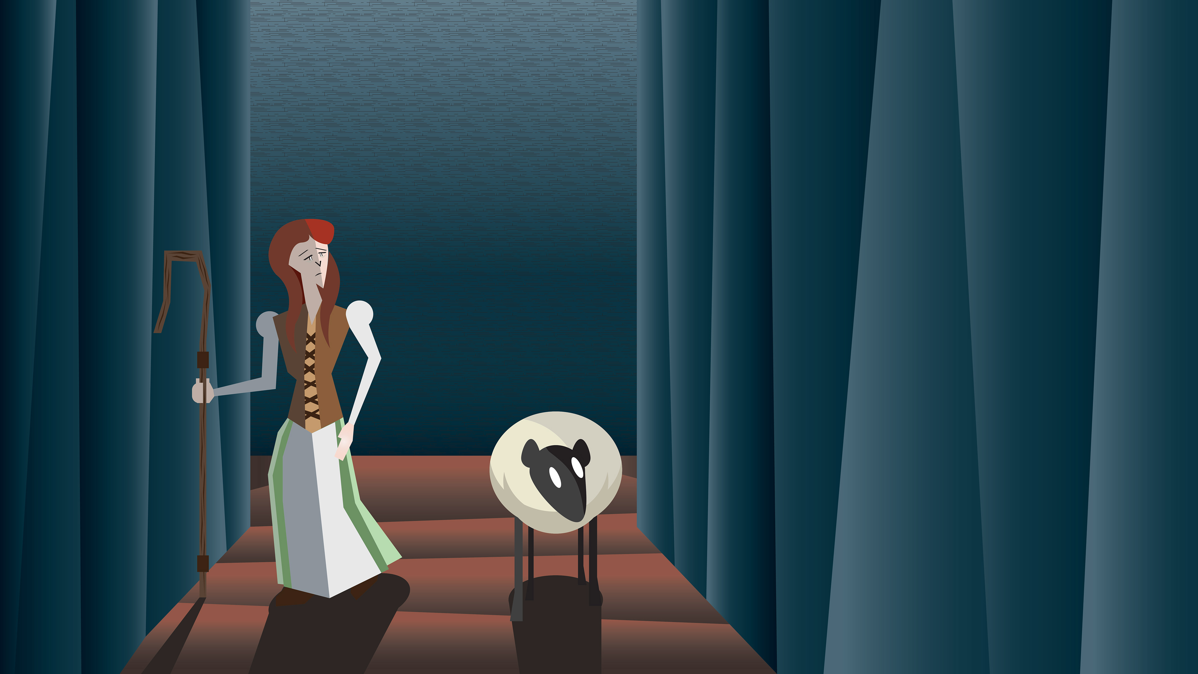
Main Menu Splash Art
Main Menu (rough concept)
Extra Splash Art
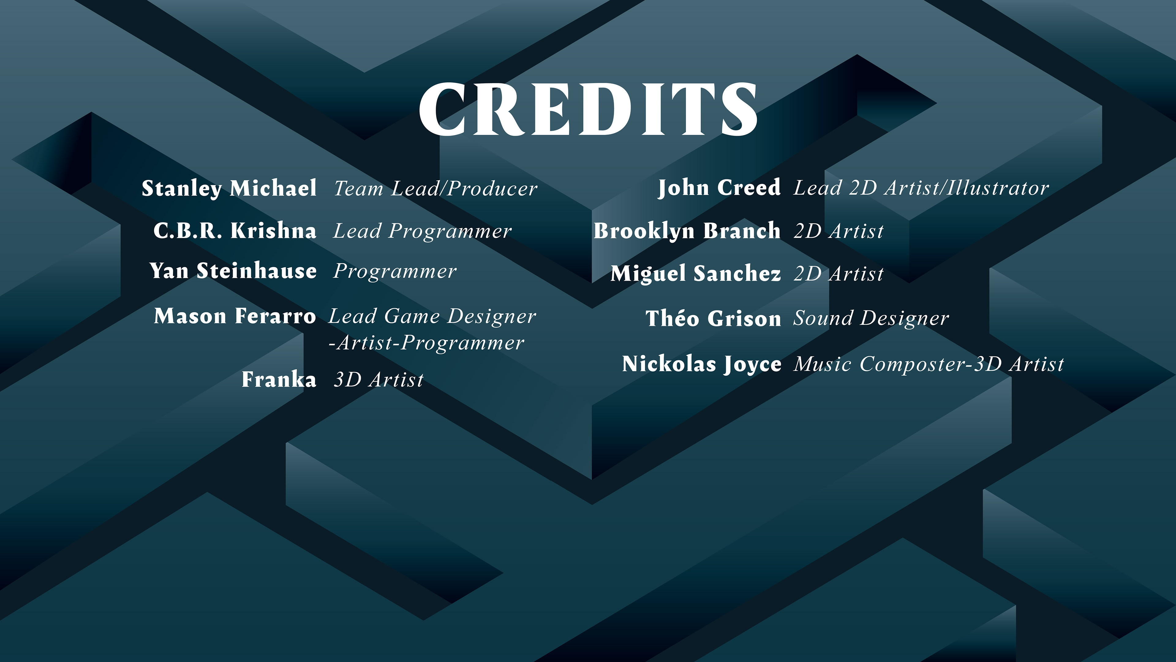
Team Credits Page
These are some splash art pieces I did for several menus featured in the game. The first image (top left) was made for the Main Menu and shows Maeve and her sheep navigating the mysterious maze. The more blank areas on the right side of the composition are reserved for the game logo and menu navigation buttons as seen in the final game (see Main Menu: rough concept on the top right). The next image (bottom left) is an extra splash art piece I made to serve as a potential default background for the other navigation menus. The final image (bottom right) is the Team Credits menu which uses the aforementioned default splash art but now has the team production credits superimposed on top of it.
Trailer-Animated Intro
This is the trailer for our game. We originally intended for this to be an introduction cutscene that would play once the player starts the game, but we instead decided to use it for our game's trailer. I did most of the animation while two of my team mates, Mason Ferarro and Nickolas Joyce, did the editing and sound/music respectively.
Shoot The Moon (2024)
Shoot The Moon is a 2D sci-fi shooter arcade game developed by my team over the course of two P1 Ignite Jam sessions between September and October 0f 2024. The game follows a monkey named Juno who is seeking to build a spaceship so that they can return home to their people. Throughout the gameplay, the player can upgrade Juno's spaceship in order to help it travel faster and overcome different obstacles while it makes its way home (the Moon itself).
I worked on this game as a 2D Artist and Animator responsible for developing the visuals for the game's UI Design. This included the official game logo, typography, and other 2D assets included throughout the game. I also worked on creating some limited animation assets that were featured in our game's gameplay trailer.
Our game won three 2nd place categories (Best Trailer, Most Innovative, and Best Art) while also winning two primary categories (Most Fun and Most Accessible) in the late-October Ignite Jam Session we submitted our game for.
Link to game prototype: https://azurite-mf.itch.io/shoot-the-moon
Official Game Logo
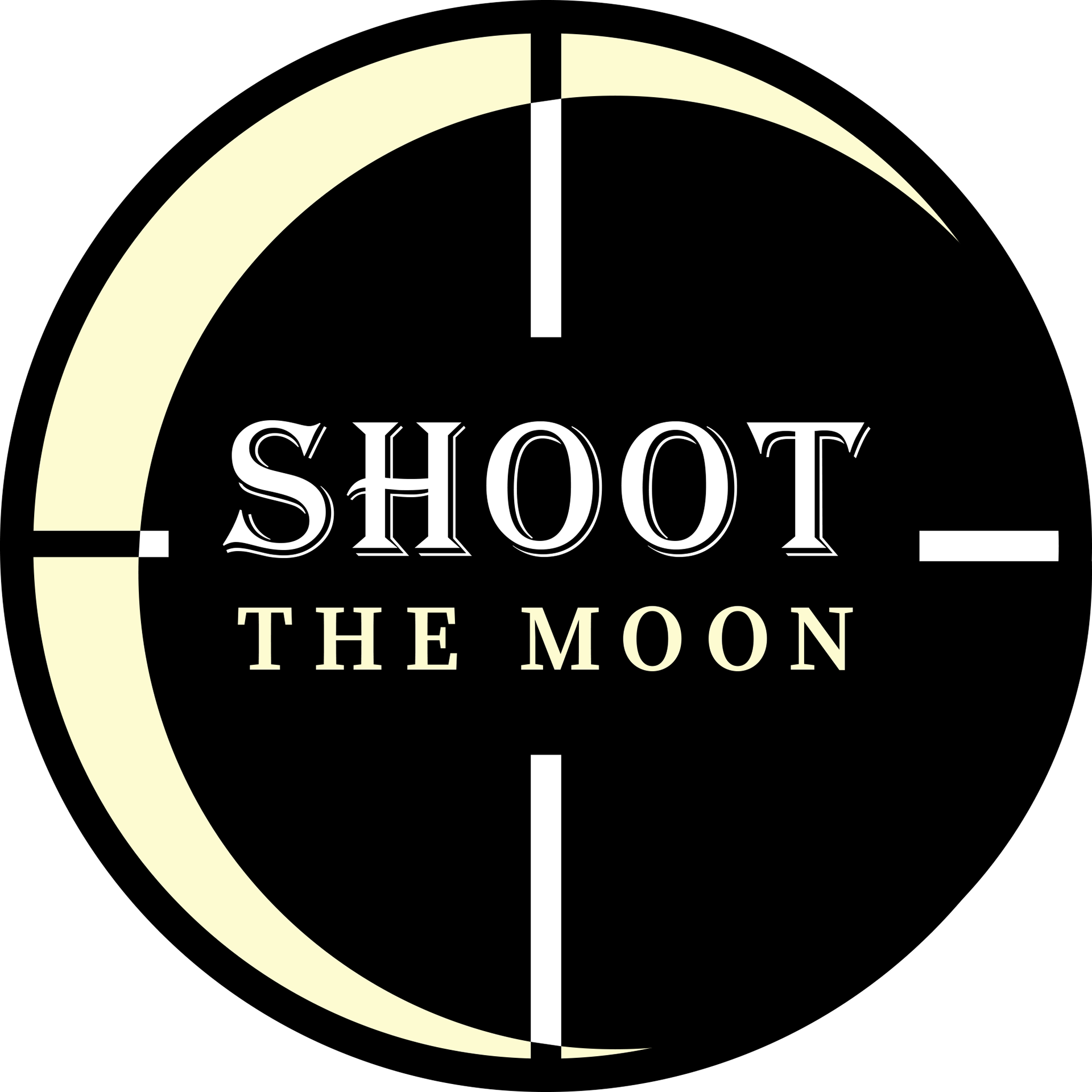
This is the official game logo I designed for our team's game. The main composition of the logo is essentially the eyepiece of a targeting scope aiming at the moon (represented by the yellow crescent on the left side). The actual game title was then added to the center where the targeting lines converge.
Intro Animation
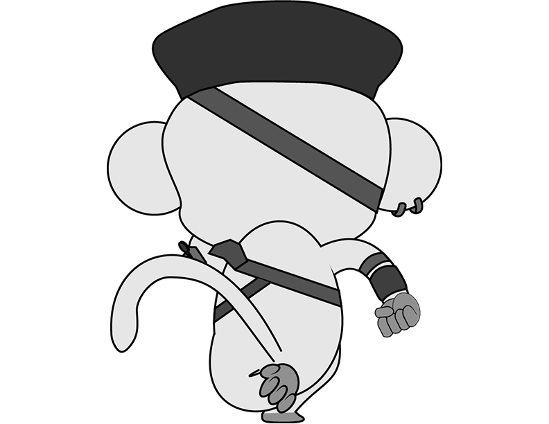
This is a short animation sequence I did for Shoot The Moon. The sequence shows Juno (the monkey) racing toward their spaceship and blasting off away from Earth and towards the Moon. This was originally meant to serve as an intro cutscene for when the player first opens up the game. Later on, however, we decided to use it for our game's official trailer that we submitted alongside our game for that Ignite Jam session.
The rocket asset was designed by my teammate Miguel Sanchez. The design of Juno was originally done by Michelle Wang while the animation sprite frames used in this short were done by Andre Parlato.
This is a GIF animation of Juno running that is featured in the animated short. As stated above, the animation sprite frames were originally done by fellow teammate Andre Parlato based on designs by Michelle Wang. After Andre shared the finished frames with me, I animated them in Adobe Photoshop and exported as a GIF which I then added to the Adobe After Effects file I used to create the finished animated sequence discussed above.
In-Game Backgrounds
Main Menu Art
Gameplay BG #1
Gameplay BG #2
Gameplay BG #3
These are some of the different gaming backgrounds I created for the game. The black and white one was designed for the game's main menu. The remaining three colored backgrounds were for the different planned levels of our game. BG #1 is the asset that is primarily used for our game's prototype.
Upgrade Menu
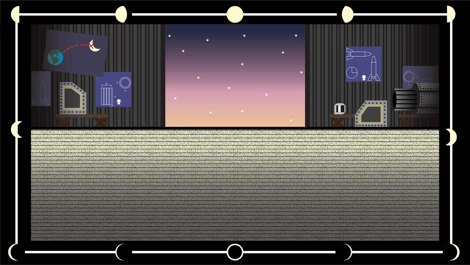
This is the background art for the upgrade menu. The top half of the composition is designed to look like a hanger workshop where Juno would design and upgrade their rocket (note the blueprints and other rocket parts scattered about). During the gameplay, the player's rocket would be placed in front of the hanger's opening where the night sky is. The bottom half below it is reserved for the upgrade menu buttons that allow the player to upgrade their ship. The border around this art is meant to showcase the different phases of the moon, with the full and new moons occupying the top and bottom centers respectively.


These are the button frames for the upgrade menu. The original idea was to have actual textboxes with the names of the different upgrade types. Later on, we instead decided to go with blank button frames which another artist (Miguel Sanchez) would design illustrations for.
Game Border Art
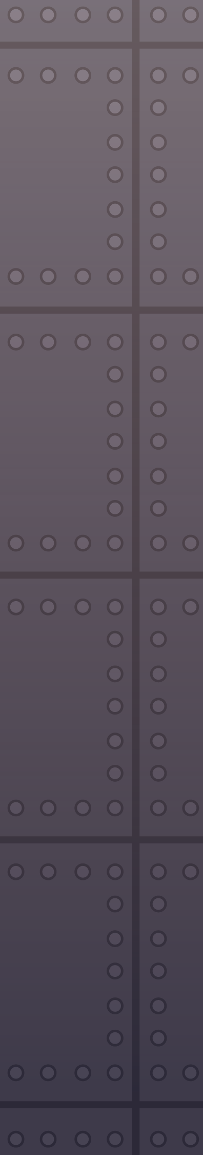
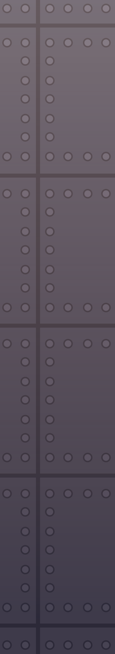
These sections are the border art that can be seen in the final gameplay. Since the actual gameplay screen is designed to be vertically (akin to older arcade games), I was tasked with creating some kind of border art that would be used to fill in the empty areas surrounding the screen. The final designs I went with were meant to appear as closeups of metal plating to differentiate them from the star-filled gameplay.
Bullet Art
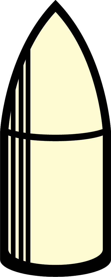
This is the design for the bullet that the rocket fires during the gameplay loop.
Feast or Famine (2024)
Feast or Famine is a 2D-tower defense game developed by my team for a P1 Ignite Jam session between July and August 0f 2024. The game is set in a mythical African land and is loosely based on African folklore and wildlife. The player follows the game's story as a villager who must gather food and resources from across the land to support your village. The player must also build defenses around his food supply in order to defend his village's livelihood from wild animals who will attack you at the end of each level (the resources act as currency you can use to purchase defenses).
As in the last Game Jam, I worked on this game as a 2D Artist and Animator responsible for developing the visuals for the game's UI Design. This included the official game logo, typography, and other 2D assets included throughout the game.
The game won 2nd place overall in the July-August Game Jam session we participated in, along with 3 minor awards in separate categories (Best Game Narrative, Most Innovative, and Emotional Masterpiece).
Link to game prototype: https://doornumberfourproductions.itch.io/feast-or-famine.
Official Game Logo
This is the official game logo I designed for my team's game. Originally, the logo was just a colored bar with patterned bars on the side and text in the middle. As the project progressed, I was encouraged to make the logo appear more "beast-like" by adding animal motifs in the overall design (ex: eyes on the patterned bars, teeth on the main yellow bar). The logo's eyes "blink" in the finished game prototype and were animated by another member of the team.
In-Game Assets
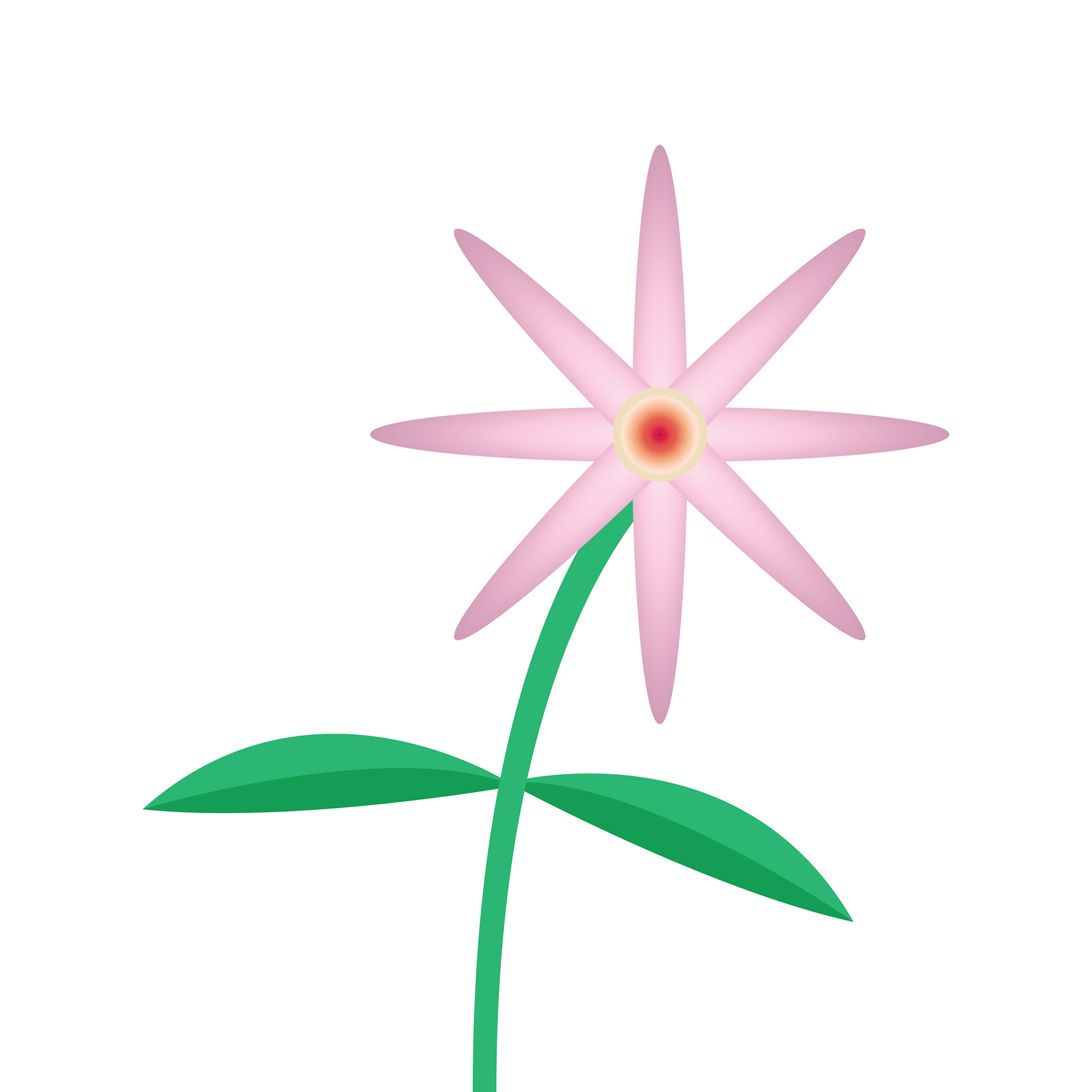
Flower #1
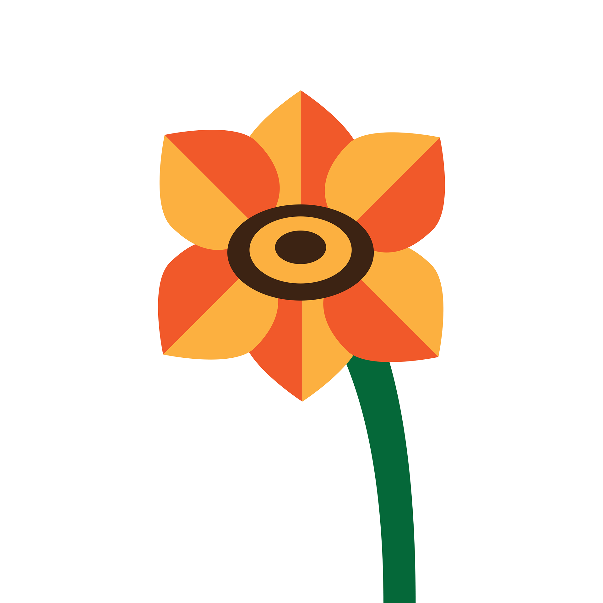
Flower #2
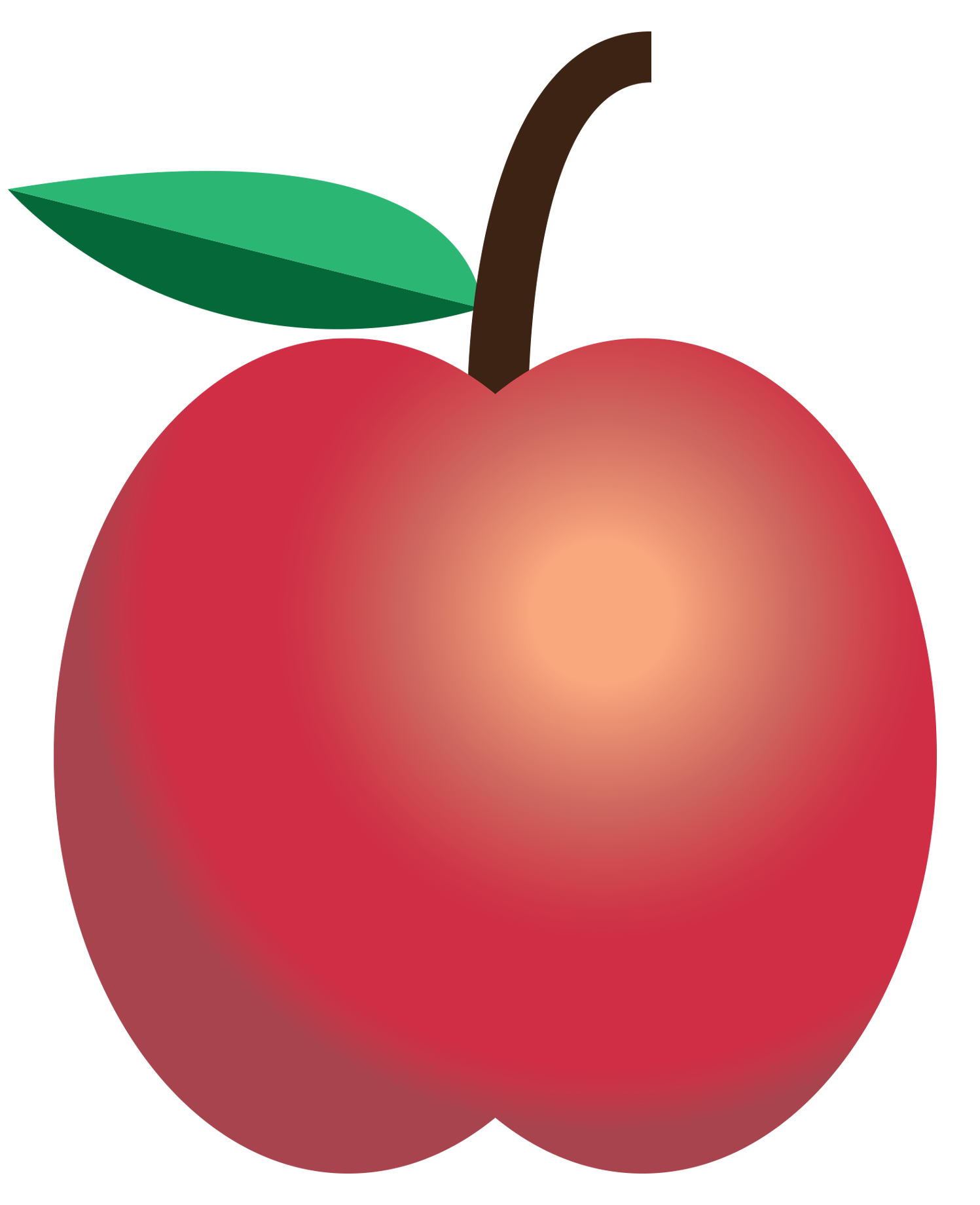
Apple
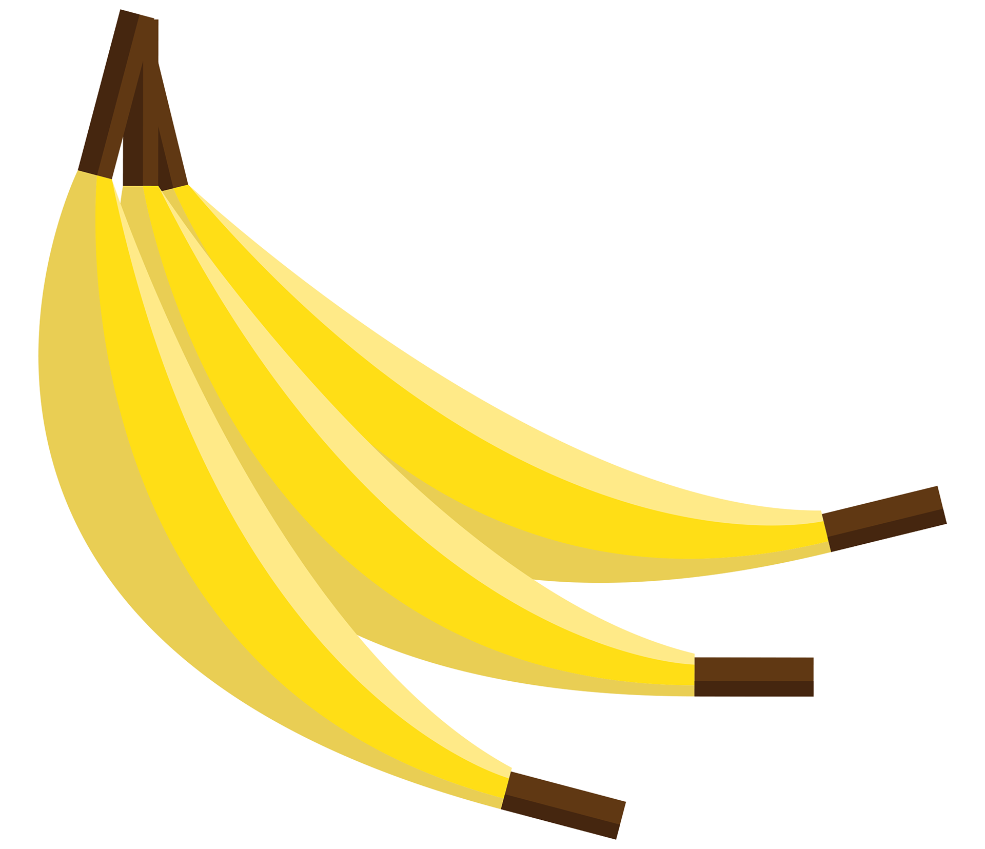
Banana
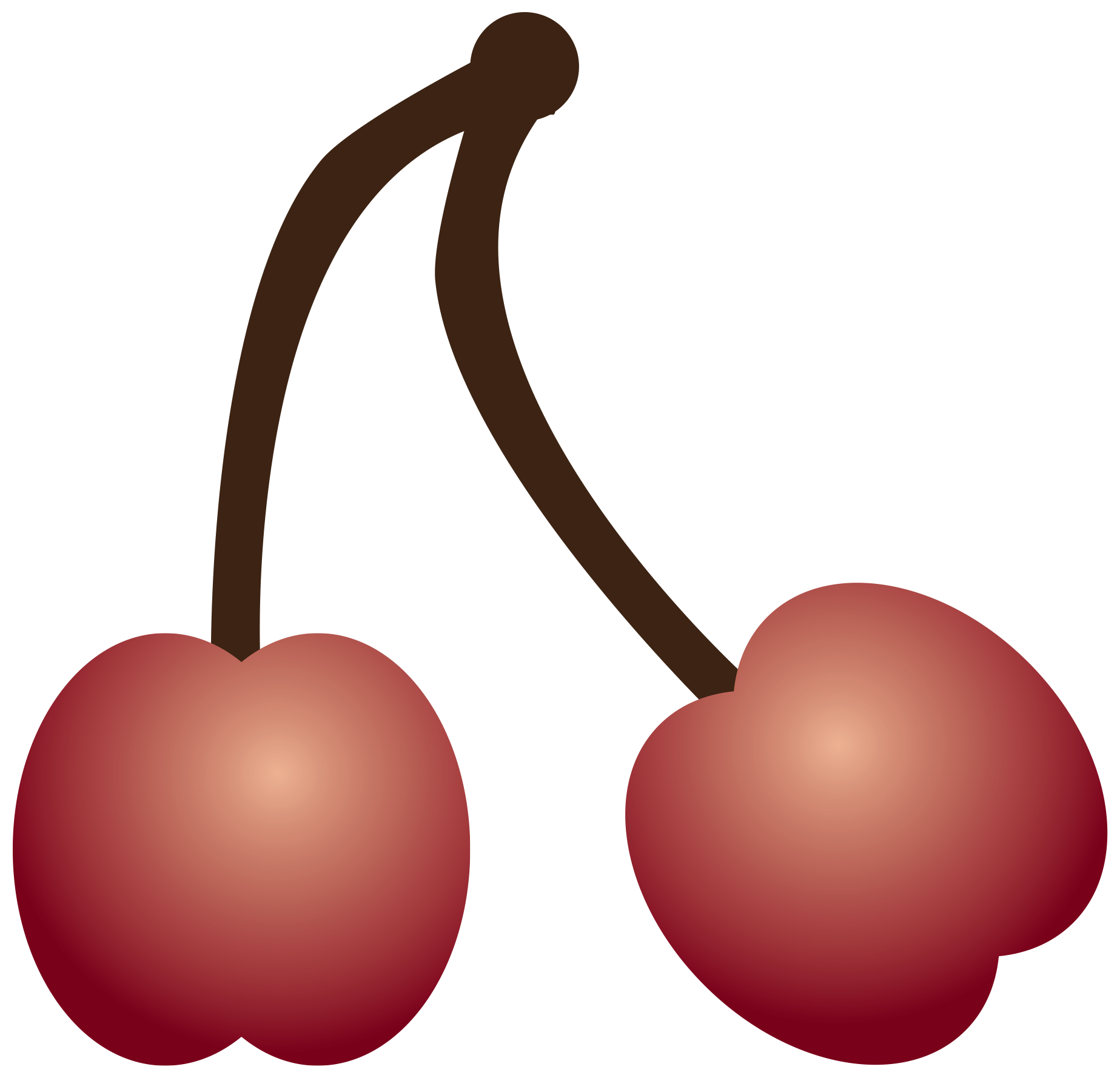
Cherry
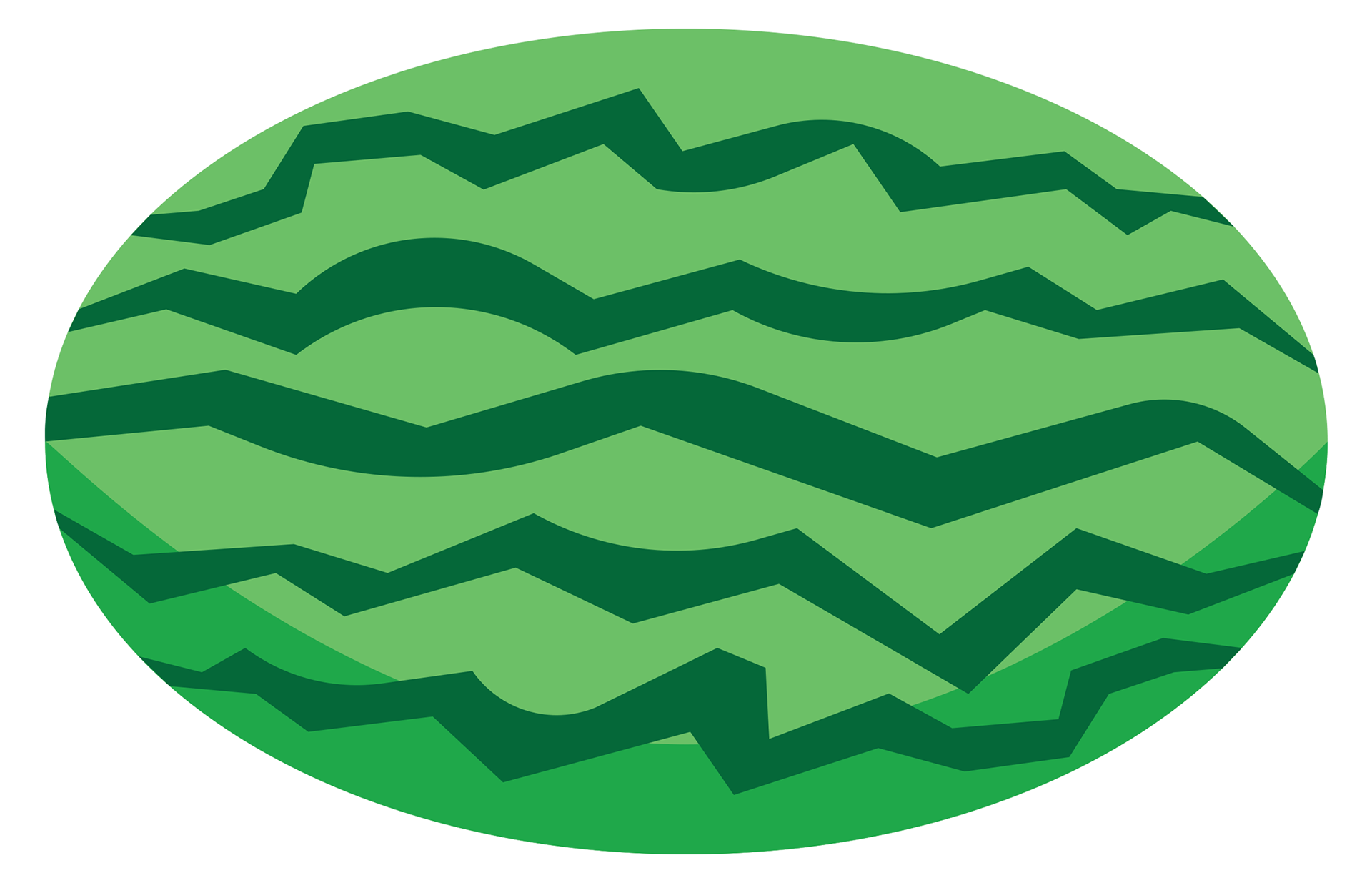
Watermelon

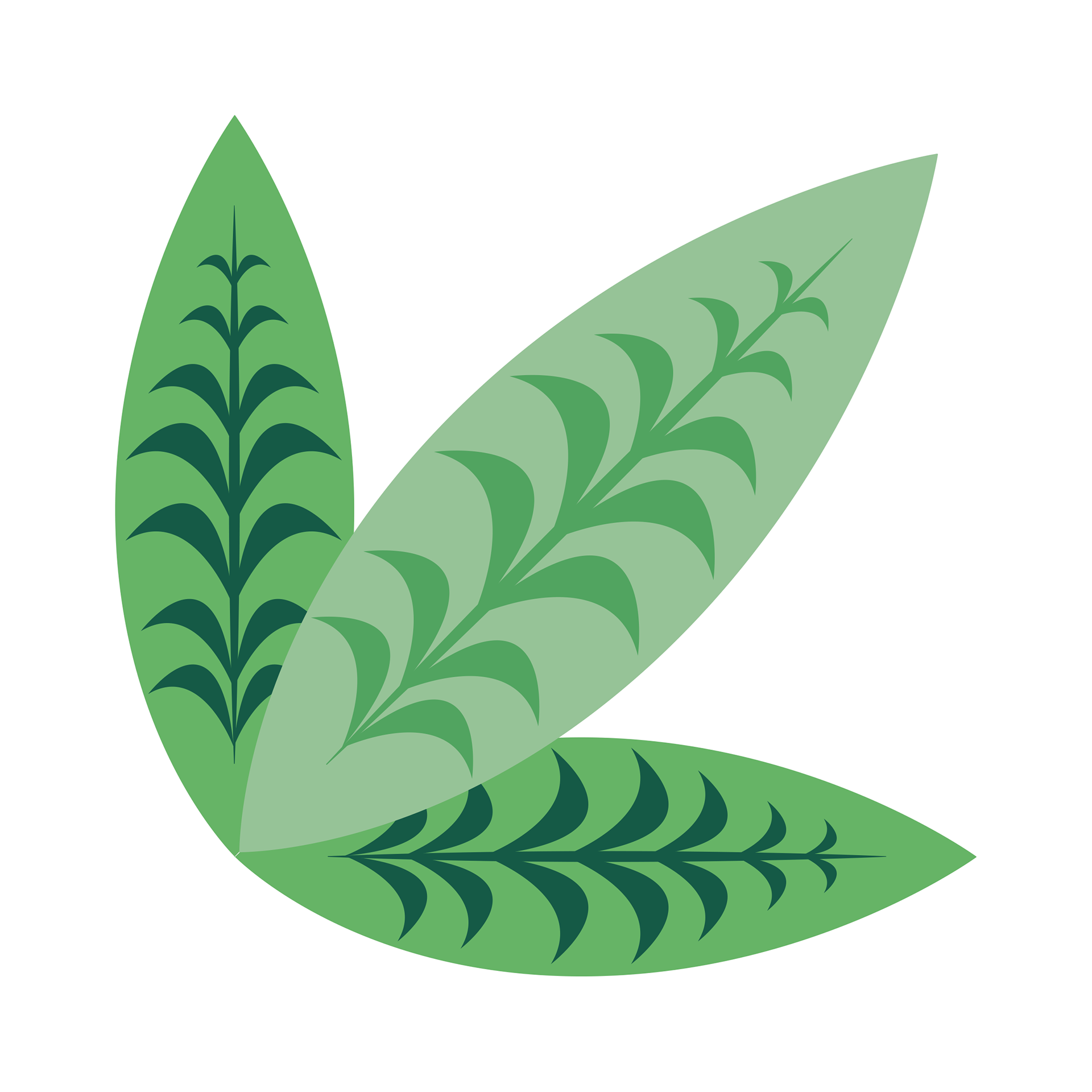
Leaf #1

Leaf #2

Leaf #3
Leaf #4
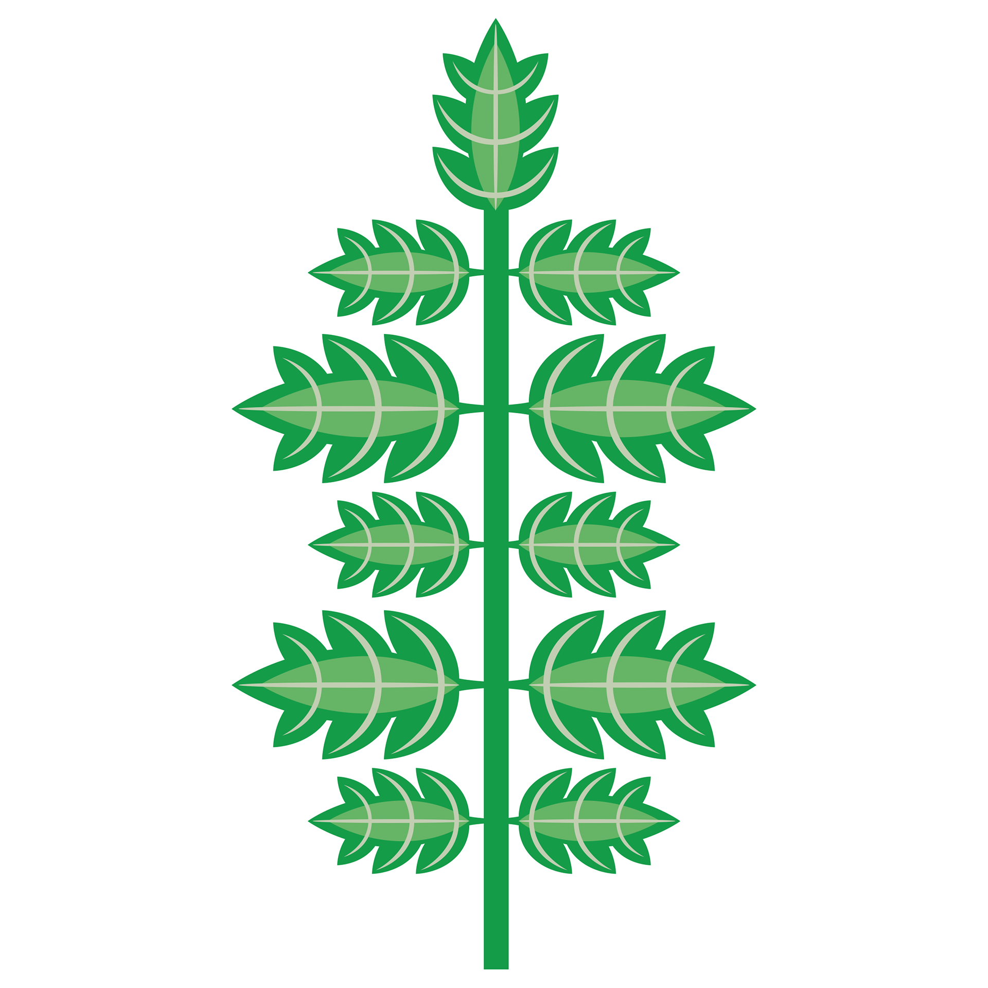
Leaf #5

Leaf #6
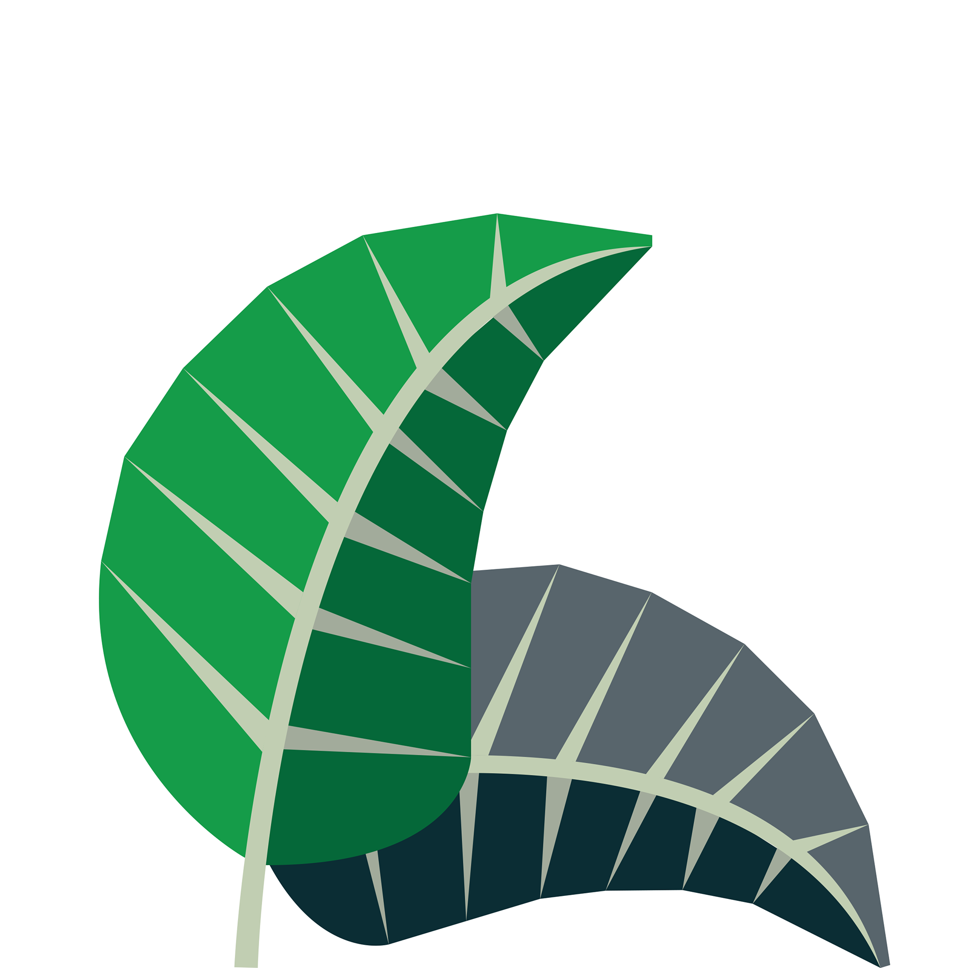
Leaf #7
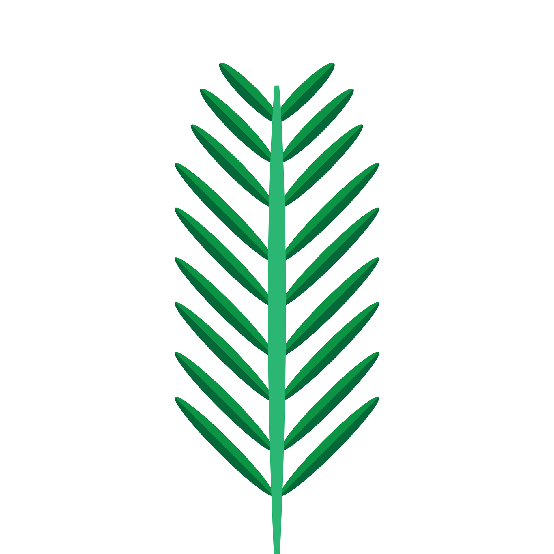
Leaf #8
These are various plants and vegetation assets I designed. Most of these different assets can be found in the splash art found in the main menu when you first turn on the game. Several assets shown here (ex: some leaves, watermelon, etc.) were animated in-game by another of my teammates.
Game Buttons
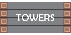
"Towers" Button
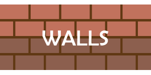
"Walls" Button

"Build Mode" Button
These are in-game buttons I created for the game's "build mode" that occurs in between each level. During this section, the player has the option to either repair or construct entirely new defenses to protect their food supply from the game's enemies. For most of the buttons' styles, I chose to style them based off of the designs of in-game assets that the player can utilize. For the "Towers" button, I modeled it after the arrow tower that players can incorporate in their defensive layout to attack against enemies. For the "Walls" button, I based it off of the mud wall that is also featured in the game. For the "Build Mode" button, meanwhile, I chose to create a separate design not based on anything in-game. Here, I created a pair of tools (a hammer and saw) superimposed against a background of wooden planks to visually emphasize that pressing this button will allow you to construct the aforementioned defenses.
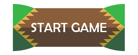
"Start Game" Button
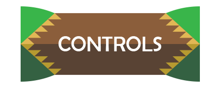
"Controls" Button
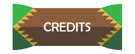
"Credits" Button
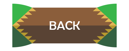
"Back" Button

"Apply Settings" Button
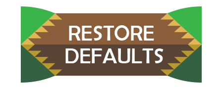
"Restore Defaults" Button

"Options" Button
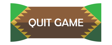
"Quit Game" Button
These are some of the menu navigation buttons I designed for the game. All eight of these designs are based on button style #22 (see Style Drafts below) which I created as a potential button draft. Here, I wanted to emphasize the beastly nature of the game by having the sides of the button resemble the teeth of a monster attacking the center of the button.
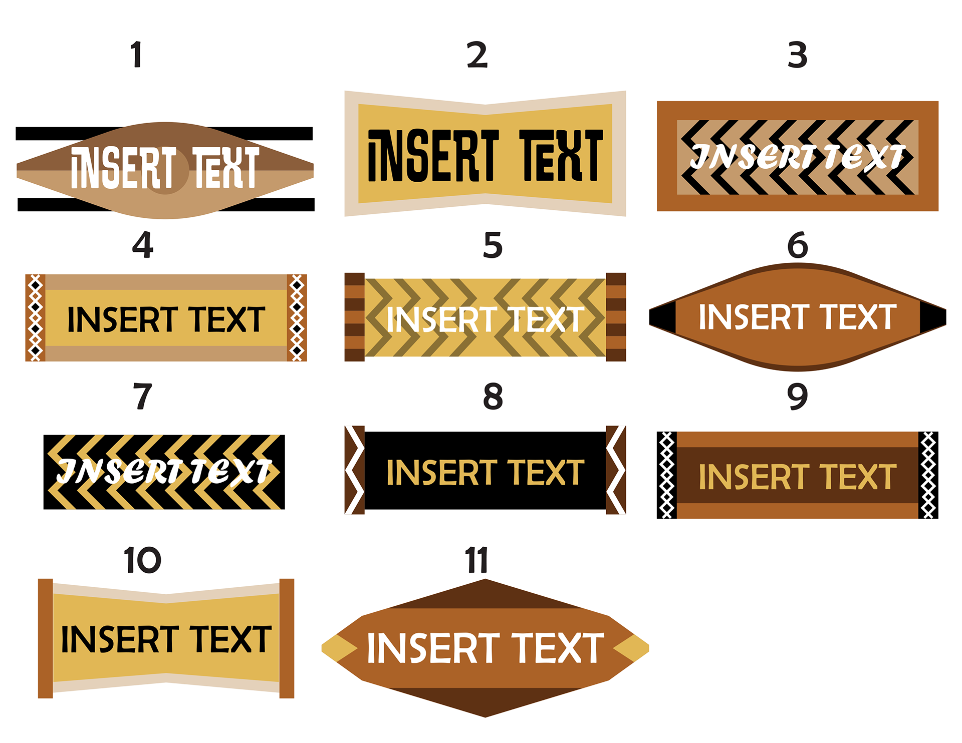
These are different potential button styles that I created for the game. For the first batch (left), I looked up basic African textile and shield art design which I then used as influence for designing the layout. The colors were based an early draft of the logo. For the second batch of logos, I was encouraged to utilize more green in the design, so I did a combination of either creating entirely new styles or simply recoloring older designs to meet this new criteria. Style #22 would eventually be chosen as the primary style for the menu navigation buttons. Style #15 would be slightly reworked to serve as a health bar for the game.
Game Typography
Rhythm of Harmony (2024)
This was the first game project I got to work on as a volunteer of P1 Games. At the beginning of the work session, our group was tasked with creating a prototype game based on the prompt "Move To The Music" which we could interpret anyway we wanted to. The final game our group subsequently developed is called Rhythm of Harmony. The game itself is a 2D-Platformer which follows the adventures of an Ancient Greek/Roman warrior who seeks to revive his war-torn land using the power of musical instruments that are scattered across the game.
I worked on this game as a 2D Game Artist and primarily focused on creating the visual design for the game's user interface (UI), along with individual 2D assets. This included creating the official game logo, menu and navigation buttons, in-game text, PFP icon, and the musical instruments.
Link to game prototype: https://doornumberfourproductions.itch.io/rhythm-of-harmony
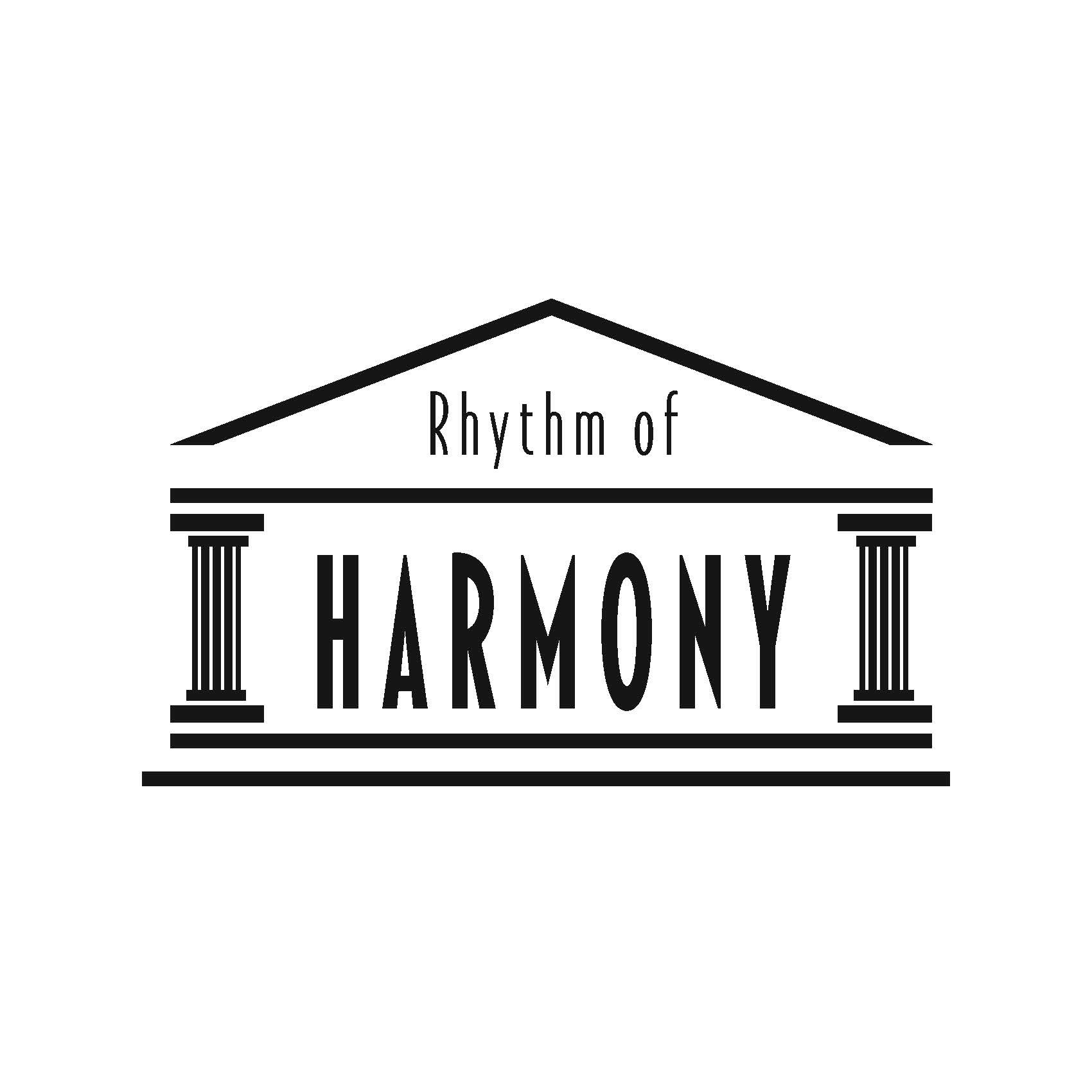
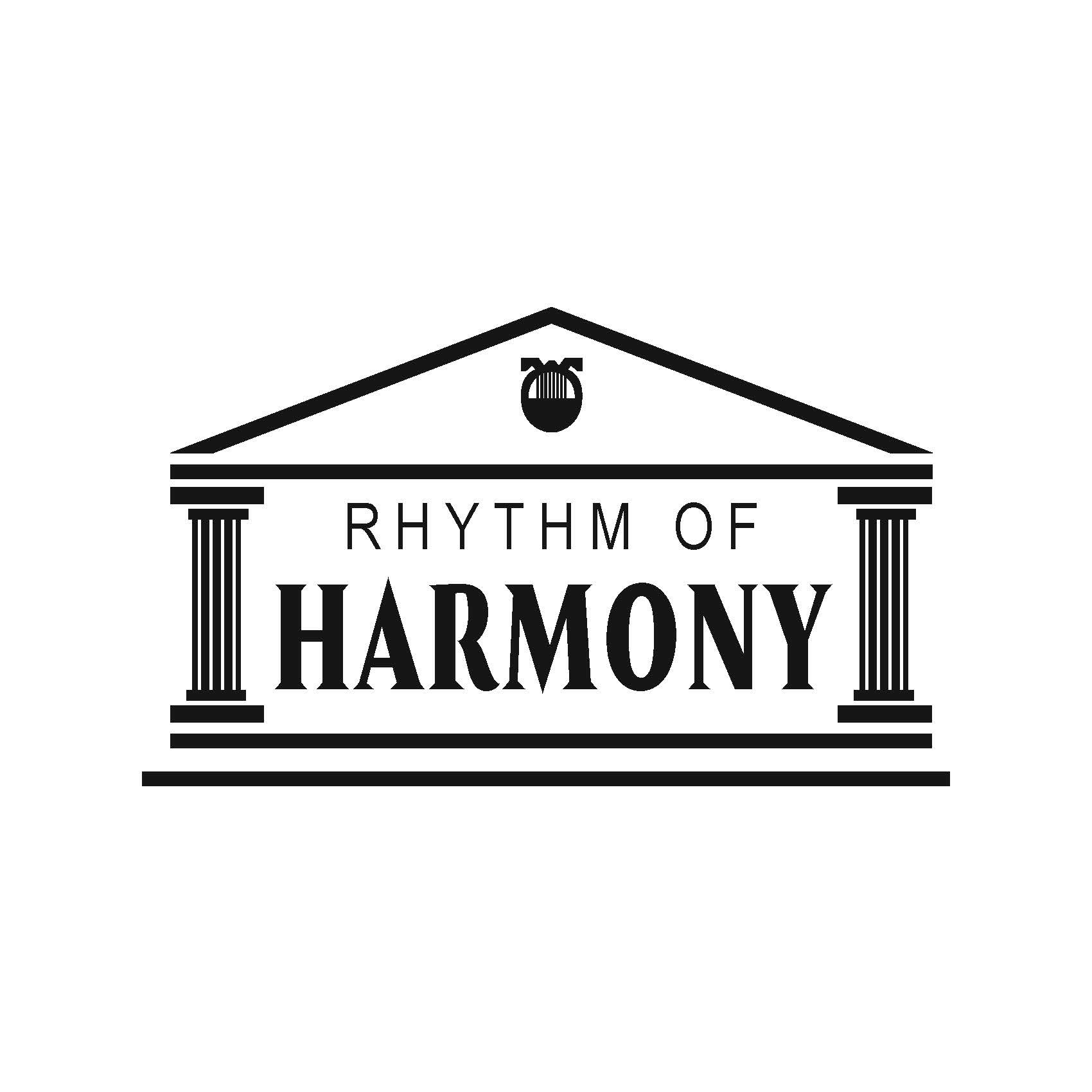
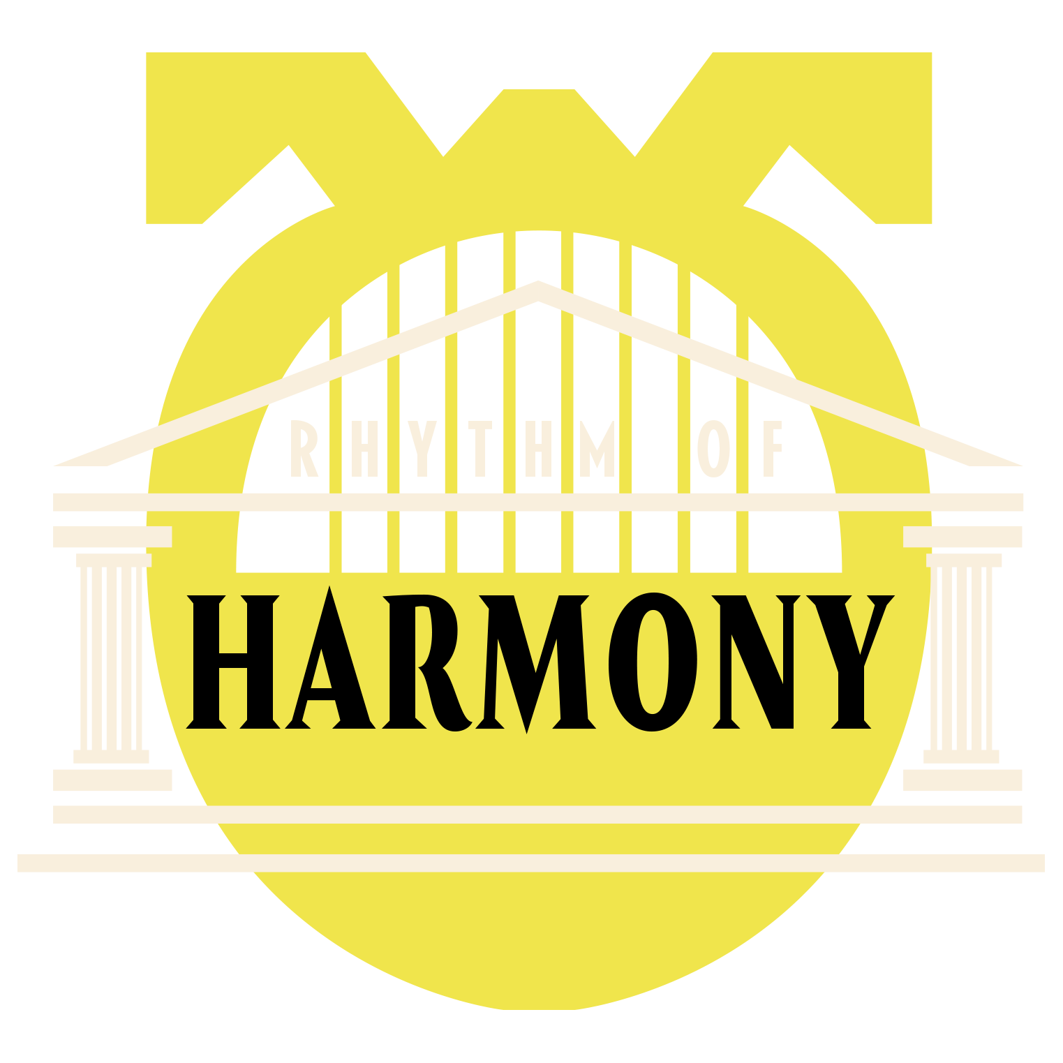
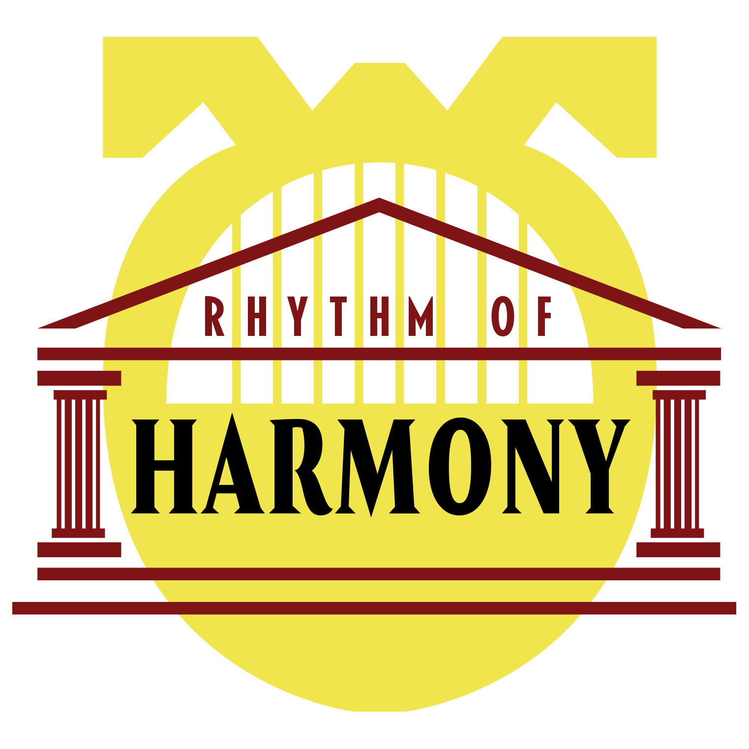
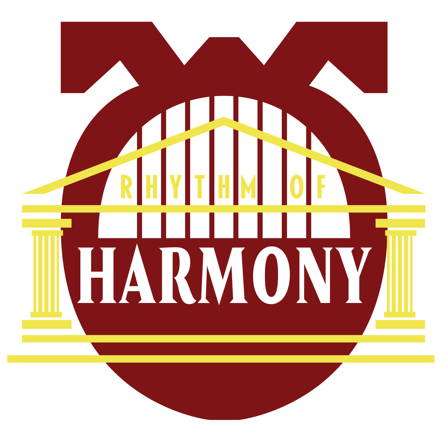
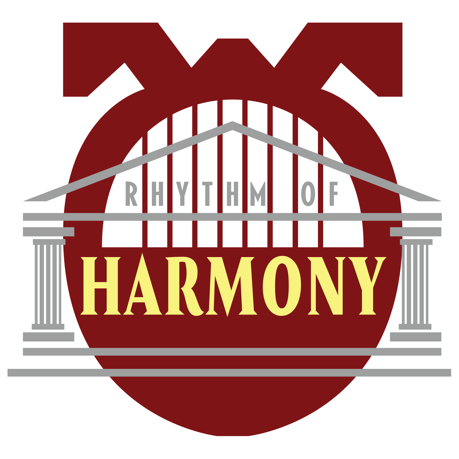
Official Game Logo
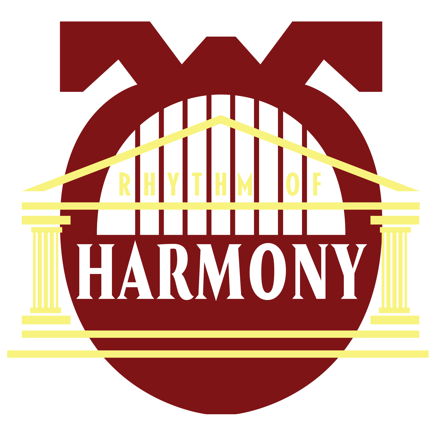
This is the official game logo we decided to go with. Since we decided to go with a classical (i.e. Ancient Greek/Roman) setting for our game, I wanted to incorporate a temple motif that would tie directly back into the game's main aesthetic while emphasizing order and harmony (thus relating it directly to the title). The lyre in the background was originally a placeholder item that I included in earlier design drafts for the logo with the intention of replacing it once the official instrument designs were finalized. However, I was encouraged by the team to keep it in to help better frame the logo. The gold and red colors were chosen to match the colors and design of the main character featured in the game.
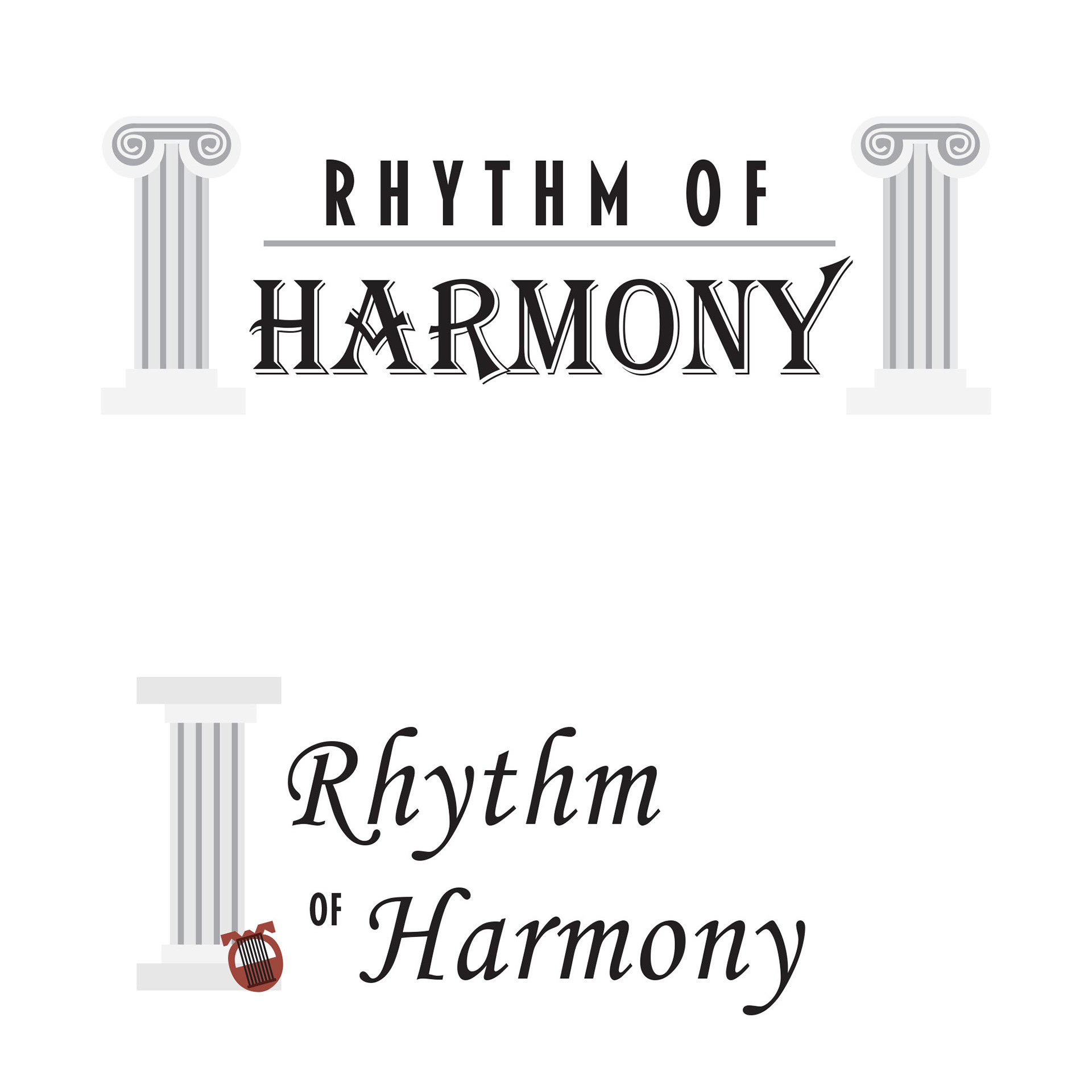
Round 1 V1
Round 1 V2
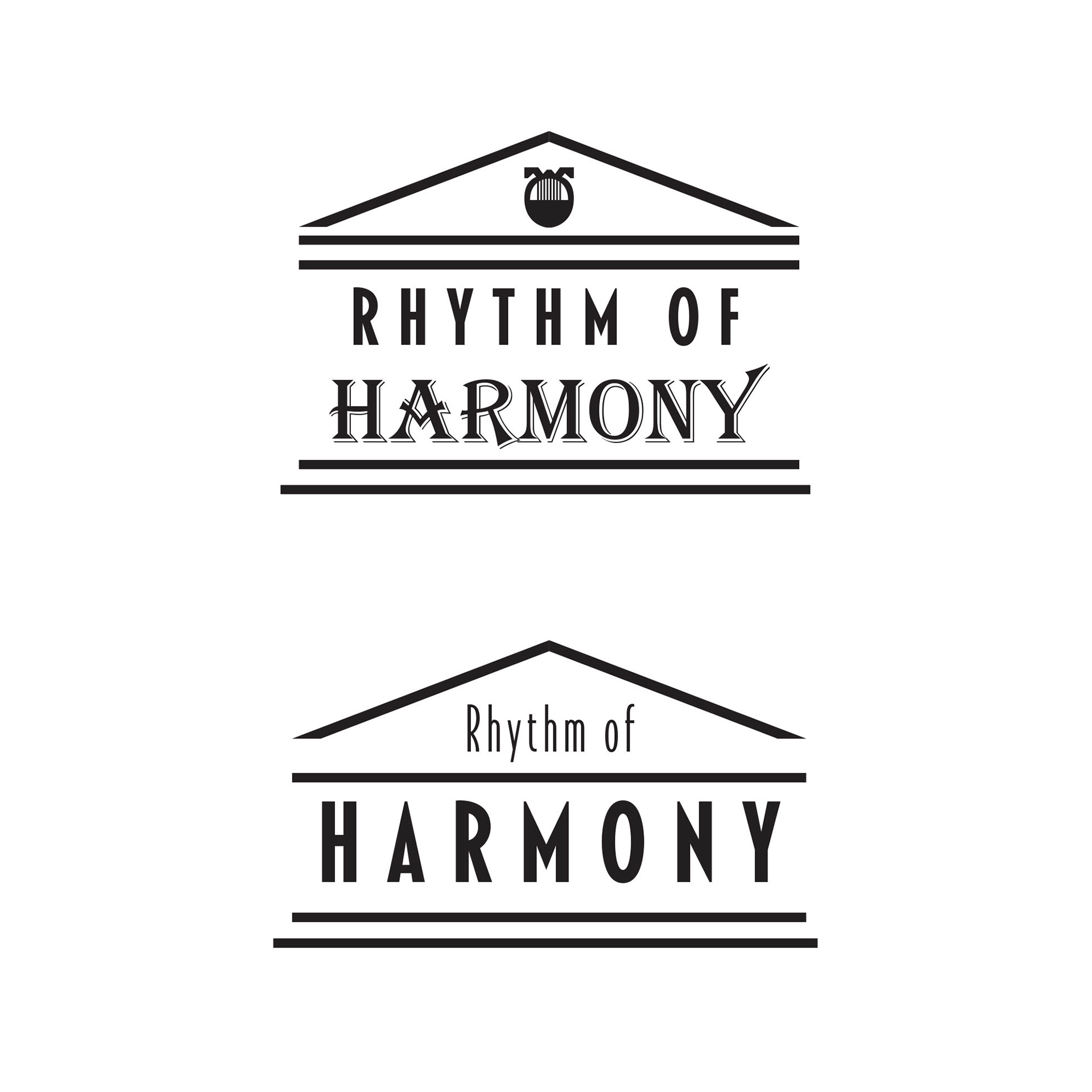
Round 1 V3
Round 1 V4
Round 2 V1
Round 2 V2
Round 2 V3
Round 3
These are logo sketches I did for the game. As the ideas developed, I wanted to create the logo to resemble more of a Greek temple to visually emphasize the harmony that the player strives to achieve in the game. The final logo variation (Round 3 V1) is what would eventually serve as the basis for the game.
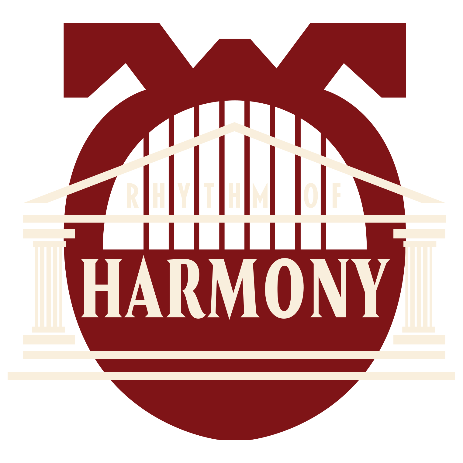
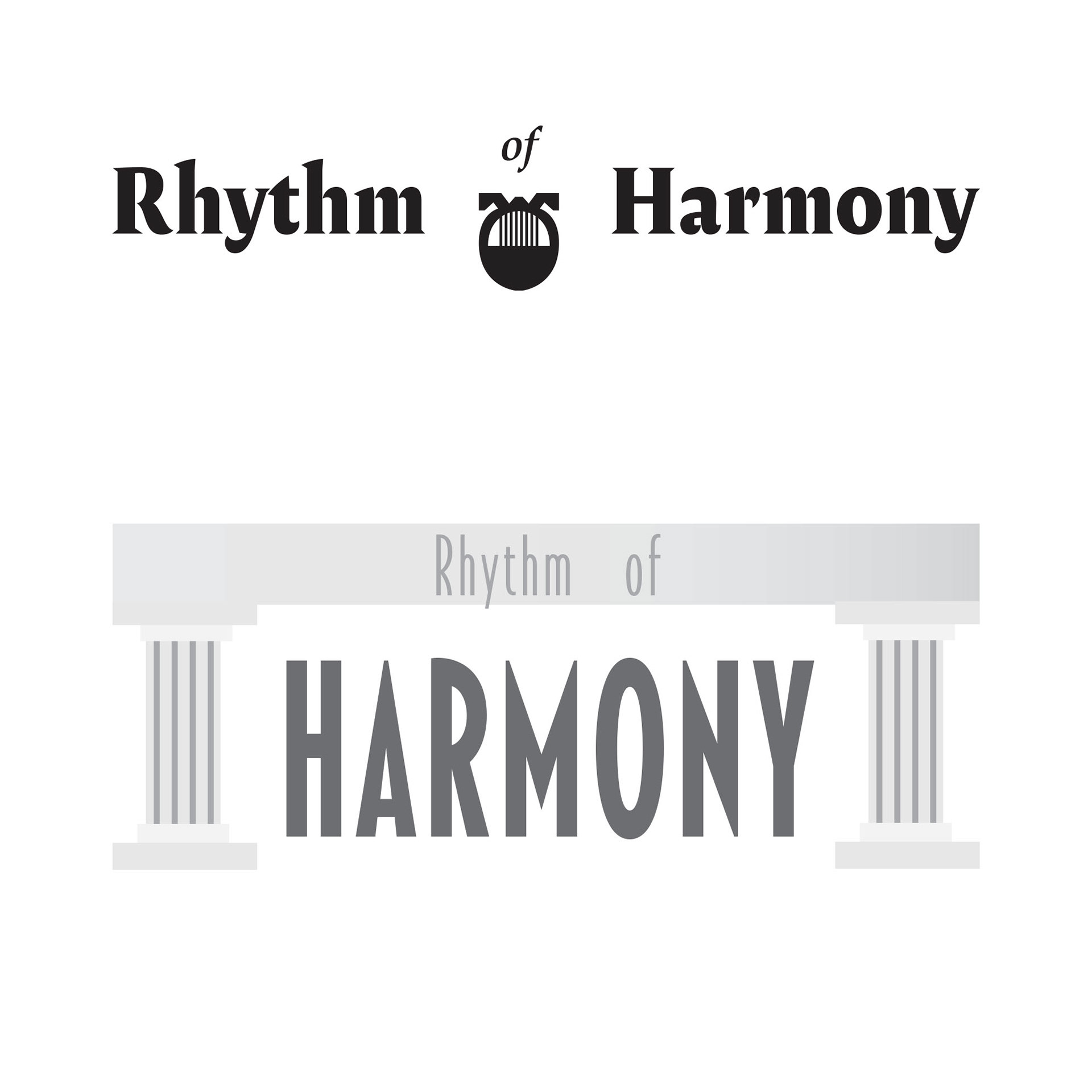
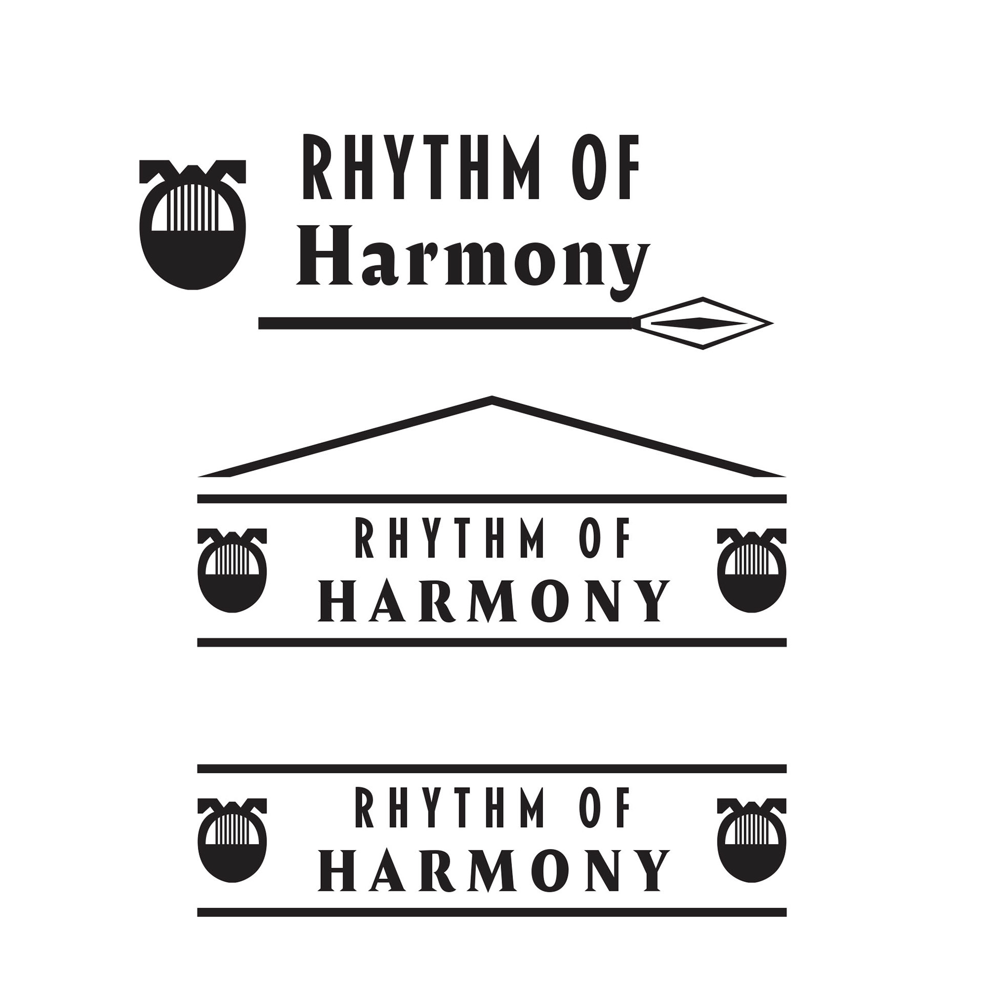
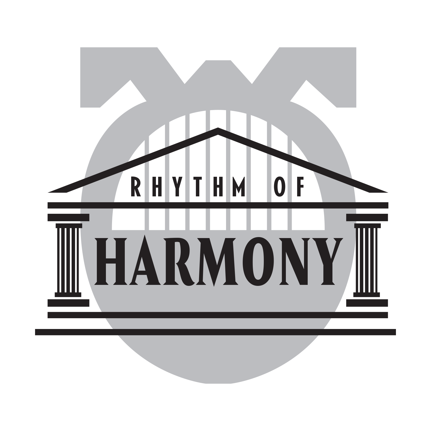
Round 4 V1
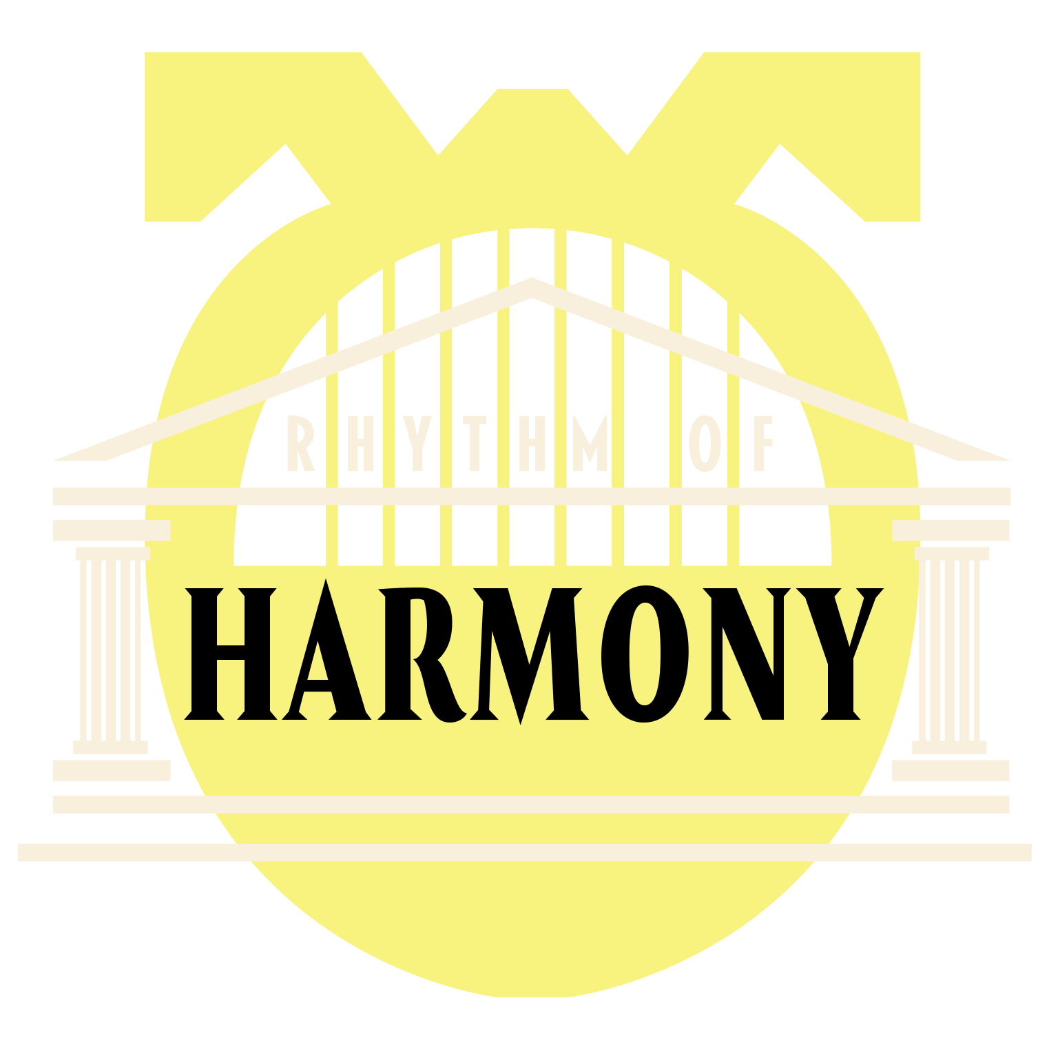
Round 4 V2
Round 4 V3
Round 4 V4
Round 4 V5

Round 4 V6
Round 4 V7

Round 4 V8
These are color variations of the official game logo I did. Each of these incorporate colors that are found in the main color scheme of the game's main character. Logo Round 4 V6 would be chosen as the official game logo.
In-Game Assets
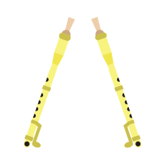
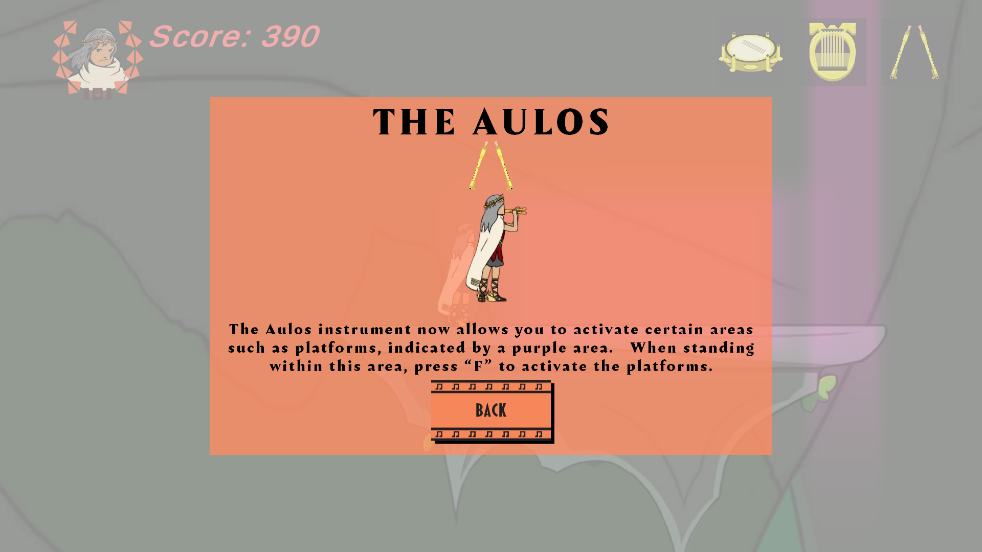
The Aulos
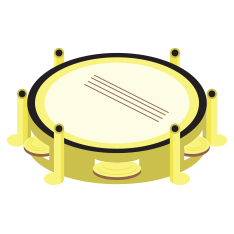
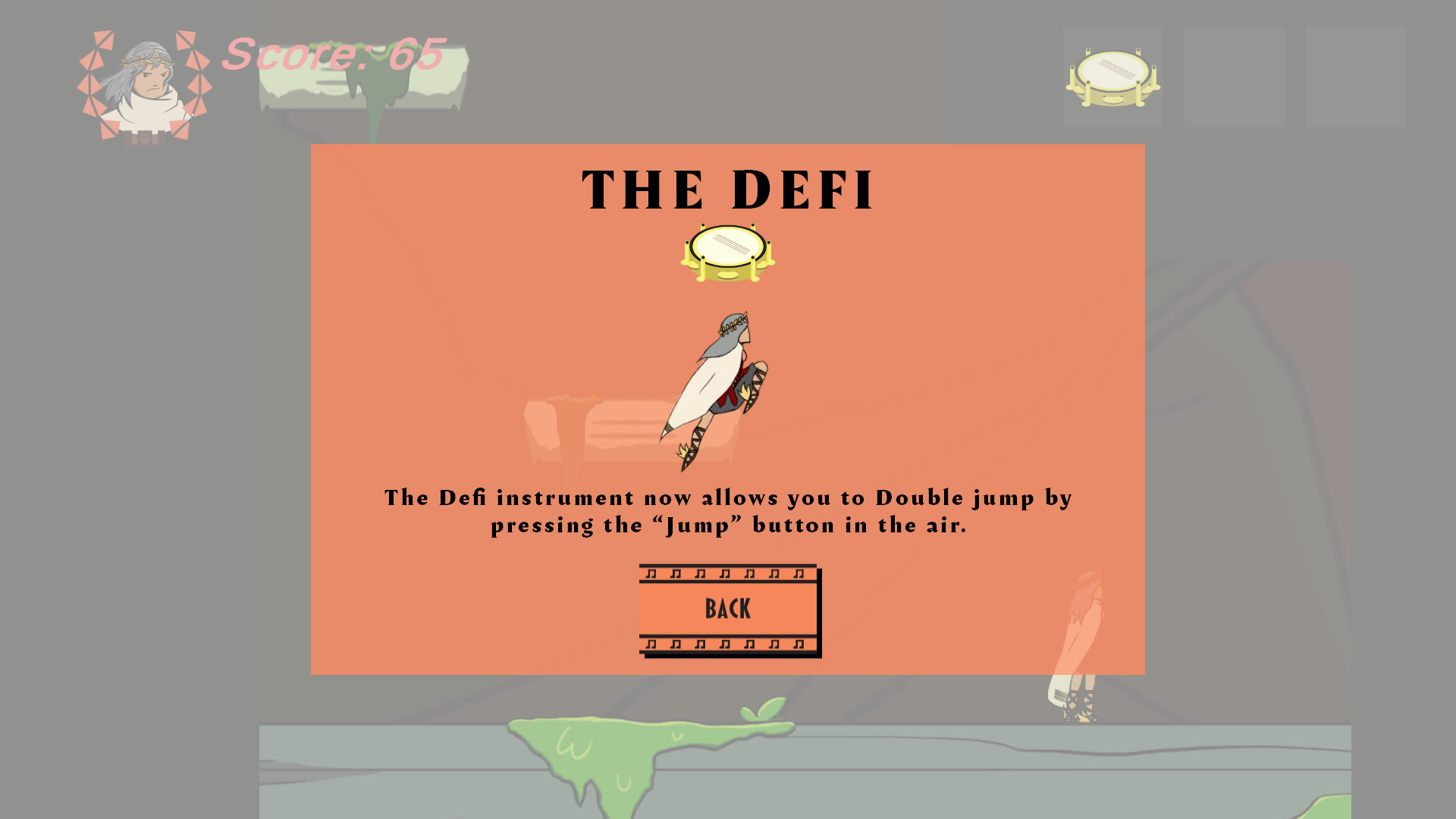
The Defi

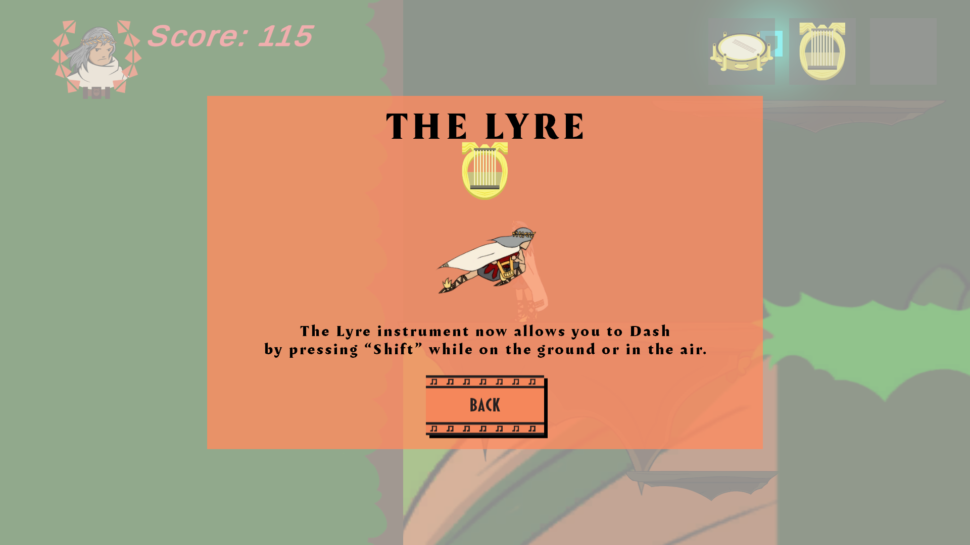
The Lyre
These are the instruments that the player can utilize while in the game. From left to right, the instruments we chose to include were an Aulos (dual-flute instrument), a Defi (Tambourine-like instrument), and a Lyre (string instrument).

This is the player's PFP icon featured in the gameplay. I designed it to resemble the classic crown of olives often found in Ancient Greece. In the actual gameplay, the empty space between the opposing arches of leaves is filled by the head of the game's main character (who was designed by Zhami, who was in charge of both character and background designs for the game).
Game Buttons


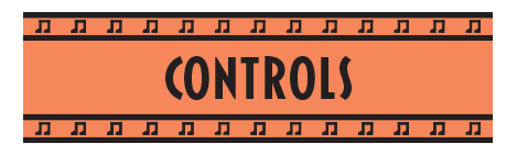
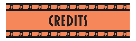


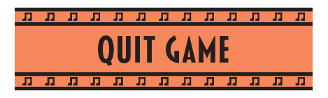

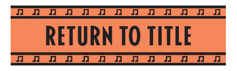

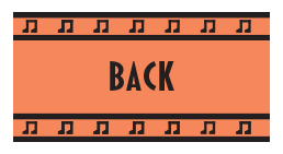
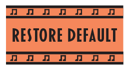
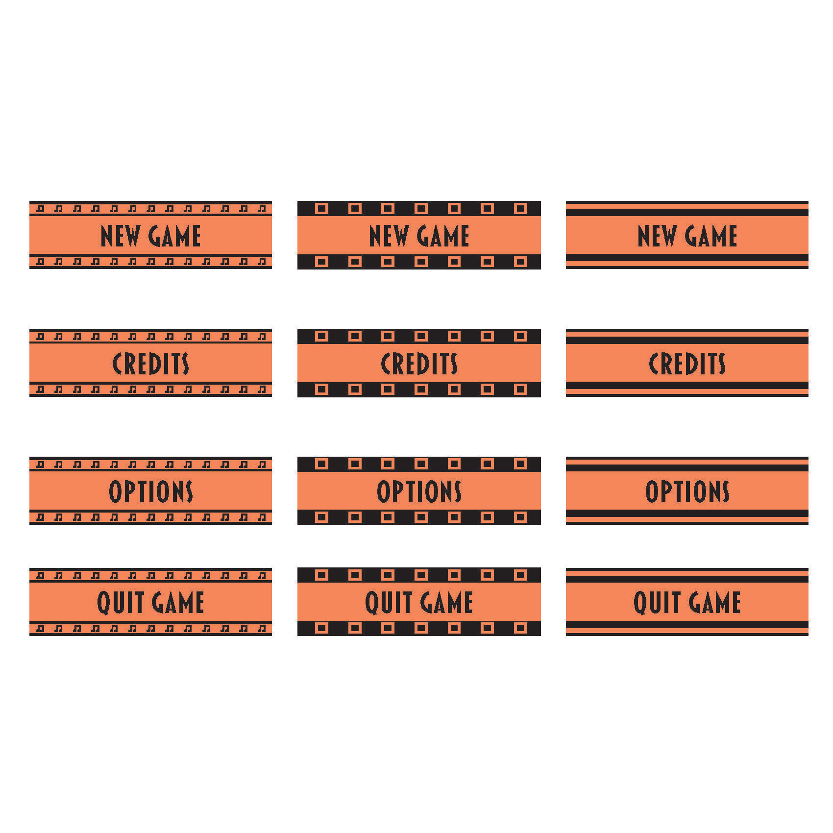
These are the menu and navigation buttons that I designed for the game's UI. For their overall design, I wanted to replicate the aesthetic of ancient Greek pottery which was traditionally designed in orange and black. The buttons utilize Blakely Bold typeface as I felt it best mimicked the appearance of ancient Greek writing. The top and bottom levels of each button contain music note motifs so as to directly tie back into the game's emphasis on music. The longer buttons featured here are main menu buttons while the shorter ones are navigation buttons that are featured in the game's sub menus (ex: Settings, Credits, Tutorial Menus, etc.).
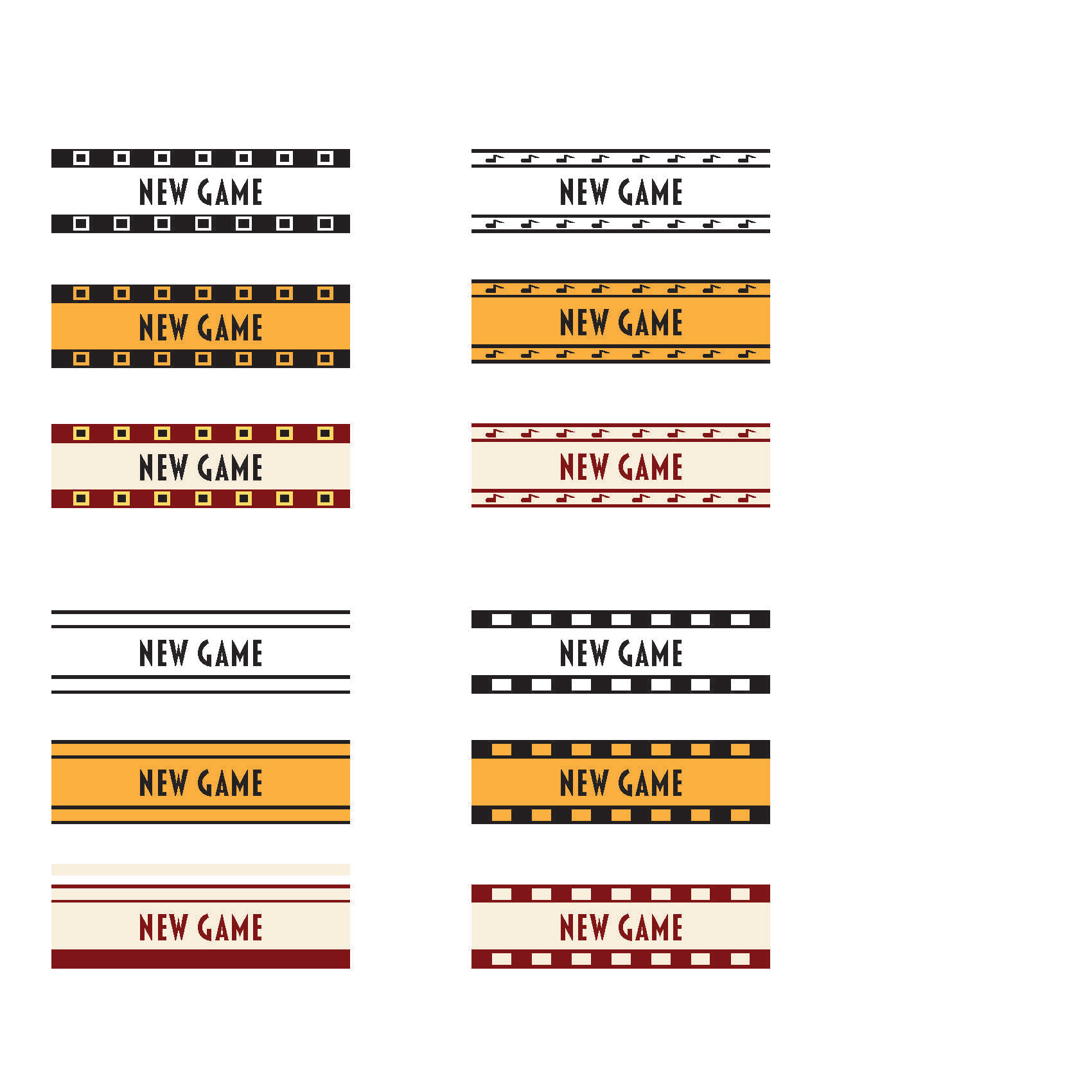
Button Drafts V1
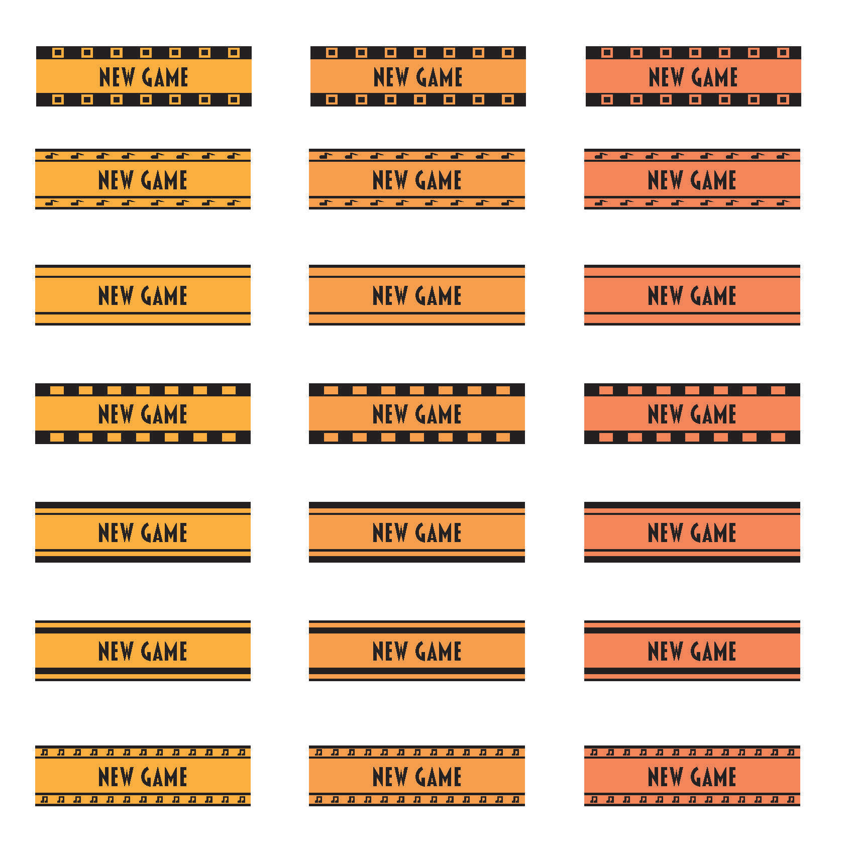
Button Drafts V2
Button Drafts V3
These are various button style drafts I created for the game. For the first batch of buttons (left image), I created several designs each with three different color variations (one in black in white, one in orange and black to mimic the appearance of Ancient Greek pottery, and one in tan and red to reflect the color scheme of the game's main character). For the second batch of buttons (middle image), the team decided to utilize the orange and black color scheme for the buttons going forward. Here, I created several more pattern designs loosely based on patterns found on Ancient Greek pottery, along with several different shades of orange so see what would make the designs look more "rustic." For the third and final batch of buttons (right image), we decided to use the darker shade of orange since it better contrasted the patterns than the other colors. I also narrowed down the pattern designs to just three final designs for my team to choose. The pattern design in the left column (with the musical note motifs) is the design we chose to incorporate into the final game.
Game Typography
These are the Tutorial Menus which explain how the player can utilize the instruments featured in the game. The instrument names are in Amster Black typeface while the directions are in Blakely Bold typeface. I designed the type layout in Adobe Photoshop and then transferred them over to the lead game designers who then incorporated them into the game's UI.
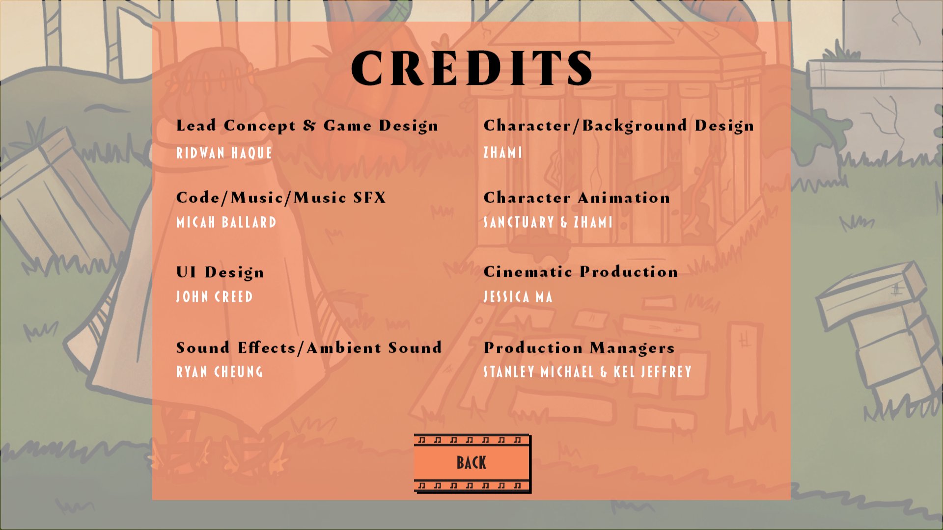
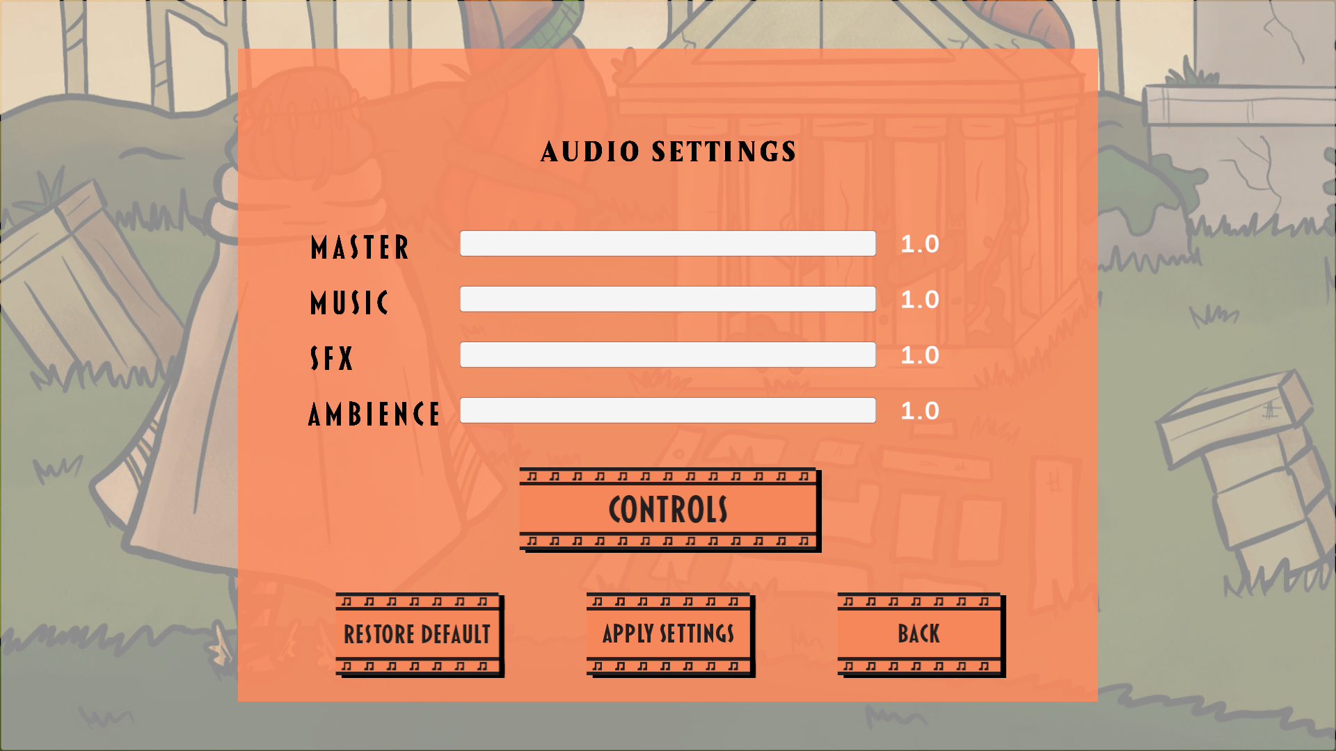
Production Credits
Options Menu
These are the sub-menus featured in the game's main menu (Credits and Options). Like with the in-game Tutorial Menus, I organized the type in Adobe Photoshop and then sent them to the lead game designers who coded them into the final game. Job positions and sub-menu titles are in Amster Black typeface while team members' names and individual options (ex: Master, Music, SFX, Ambience) are in Blakely Bold typeface.