In 2024, I took up a graphic design internship position with Trill Mag, a small digital news publication based out of the United Kingdom. I was a member of the video production and article content creation teams, where I was assigned to create illustrations and thumbnail images to accompany the various articles and videos that the magazine published on both its main website and other media channels (i.e. Instagram, TikTok, Youtube, etc.).
Article Illustrations/Cover Images
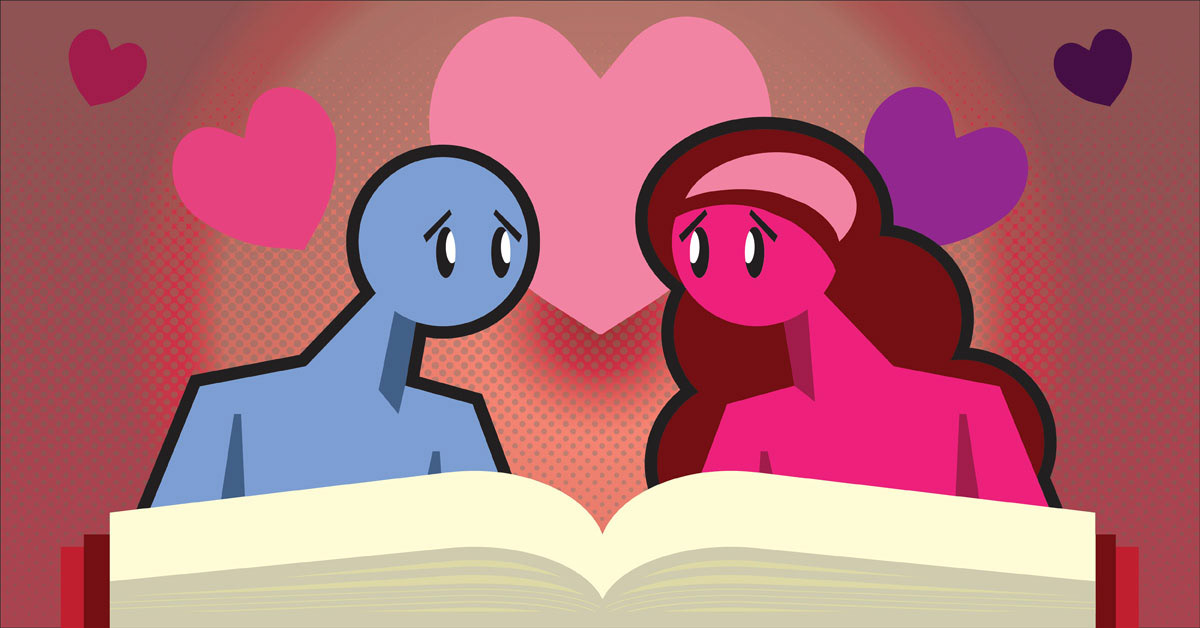
5 Romance Books That Will Make You Believe In Love Again
I created this illustration for an article about different romance books recommended by the article's writer. For the illustration, I decided to showcase 2 caricatures of a guy and a girl falling in love with each other as they are reading a book laid out before them. The layout is similar to my "Modern Love" illustration, except with more emphasis on love.
Original Article: https://www.trillmag.com/culture/5-romance-books-that-will-make-you-believe-in-love-again/
7 Short but Unforgettable Books to Finish in a Day
I created this illustration for an article about 7 different short books recommended by the article's writer. For the illustration, I tried to encapsulate all 7 of the books described by the author into a single composition. Most of the books discussed are represented except for Tender Is The Flesh which was not part of the original pitch (most likely replaced The House on Mango Street, which was part of the pitch).
Original Article: https://www.trillmag.com/culture/books/7-short-but-unforgettable-books-to-finish-in-a-day/
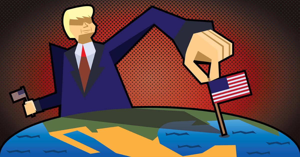
Trump's New Spanish Empire
I created this illustration for an article about how President Donald Trump has been trying to expand America's influence by "reclaiming" many natural landmarks and rebranding them as pure American treasures. To showcase this, I took inspirations from old imperialist political cartoons and drew Trump as an imposing, larger than life figure claiming what he thinks is rightfully his. To show him spreading his influence, I depicted him planting tiny American flags on the Gulf of Mexico (or Gulf of America), with a second one in his other hand for Mount Denali/McKinley.
Original Article: https://www.trillmag.com/news/politics/trumps-new-spanish-empire/
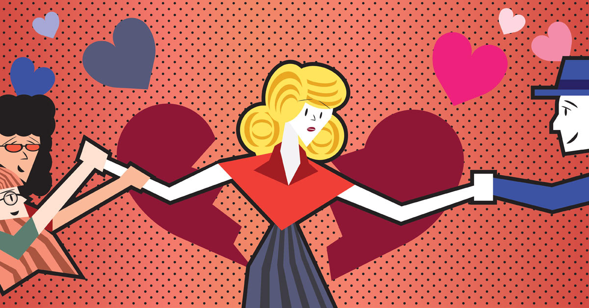
Modern Love: How to Balance Platonic and Romantic Relationships
I created this illustration for an article about how difficult it is for people (mainly women) to balance their love lives with their social lives that they share with friends. Here, I showed a young woman being pulled every which way by 2 opposing forces: her friends on the left, and her boyfriend/romantic lover on the right. I tried to give it a more cutesy 1950s style similar to those found on older Valentine's Day cards of that era.
Original Article: https://www.trillmag.com/life/love-relationships/modern-love-balancing-platonic-and-romantic-relationships/
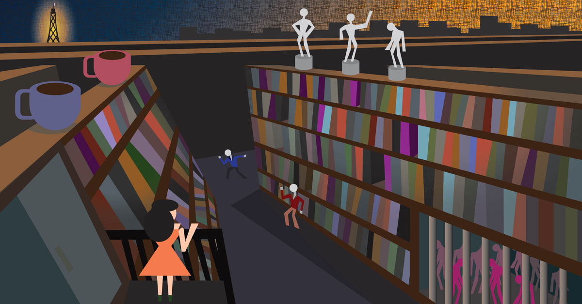
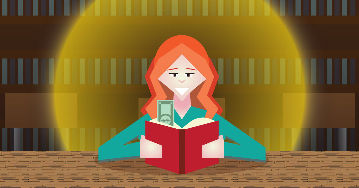
The Charm of Books For Under $10
I created this illustration for an article about the hidden charm that can be found in buying cheaper books. When brainstorming ideas, I immediately knew what the basic composition would be: a person reading a book while using a $10 bill as a book mark (to visually show how cheap said book was). The final composition I created features a college-age girl reading in a library setting while emitting a golden aura around her to symbolize the joy she is experiencing from her new (and cheap) book.
Original Article: https://www.trillmag.com/culture/books/the-charm-of-books-for-under-10/
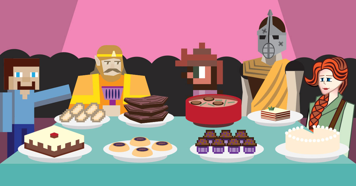
Top 5 Foods From Gaming I'd Love To Try
I created this illustration for an article by writer Cody Lendle where they discuss delicious meals from popular video game franchises that they would want to try in real life. For the composition, I created a banquet party that features characters from different video games gathering around a food table filled with delectable delights from their respective franchises. From left to right, the characters I featured in the final illustration are: Steve (Minecraft), King Harkinian (The Legend of Zelda), a generic NPC (Terraria), a knight character (Skyrim), and Leah (Stardew Valley).
Original Article: https://www.trillmag.com/entertainment/gaming/top-5-foods-from-gaming-id-love-to-try/
Kickstart This Fall Season With These 6 Books You Have To Read
For this article, me and another illustrator (Kayla Martinez) worked together to create a series of fall-themed illustrations based on article writer Ileana Hernandez's book choices for the 2024 fall season. The books I chose to illustrate for were The Complete Tales and Poems of Edgar Allan Poe (#2 on list), The Dead Romantics by Ashley Poston (#4 on the list), and These Silent Woods by Cunningham Grant (#6 on the list). For each of these illustrations, I tried to give each book a fall-esque landscape while highlighting elements that are found in each of their respective books (ex: A raven and Edgar Allan Poe himself wandering the University of Virginia campus for The Complete Tales, a gravestone and ghost accompanying the main female character for The Dead Romantics, and an eerie cabin in a mountainous autumn wood for These Silent Woods).
Original Article: https://www.trillmag.com/read/kickstart-this-fall-season-with-these-6-books-you-have-to-read/
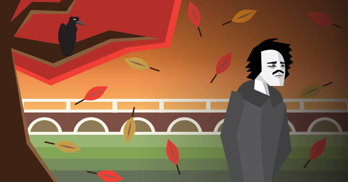
The Complete Tales and Poems of Edgar Allan Poe
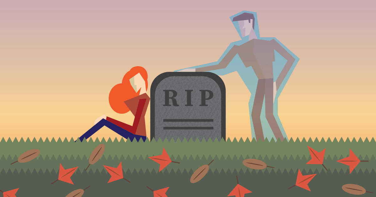
The Dead Romantics
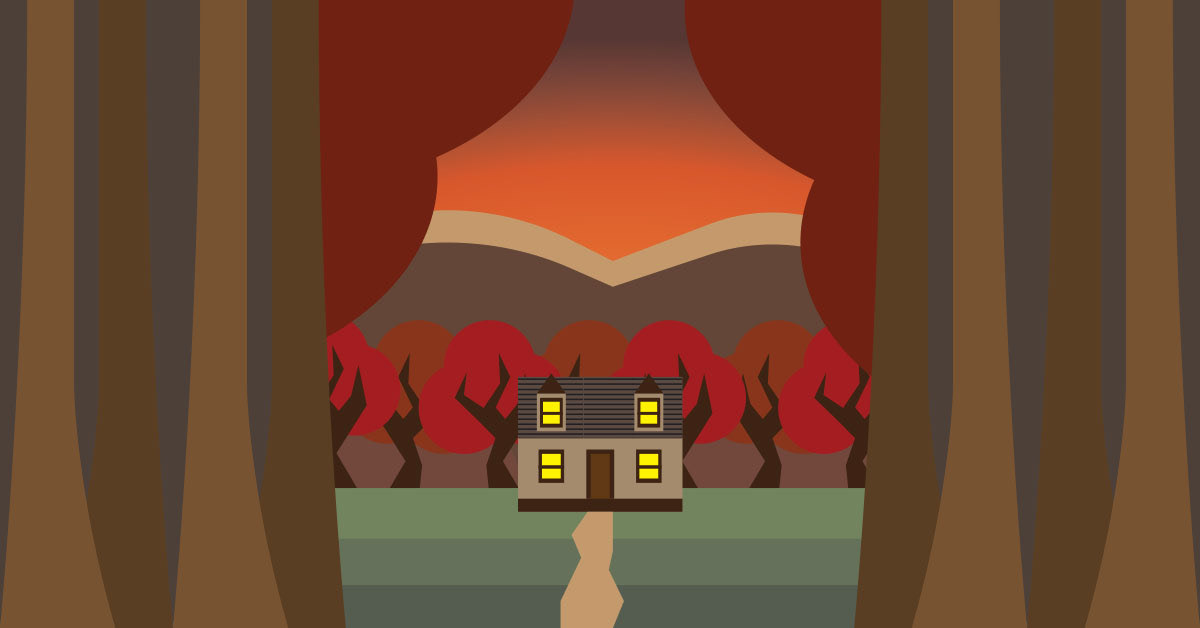
These Silent Woods
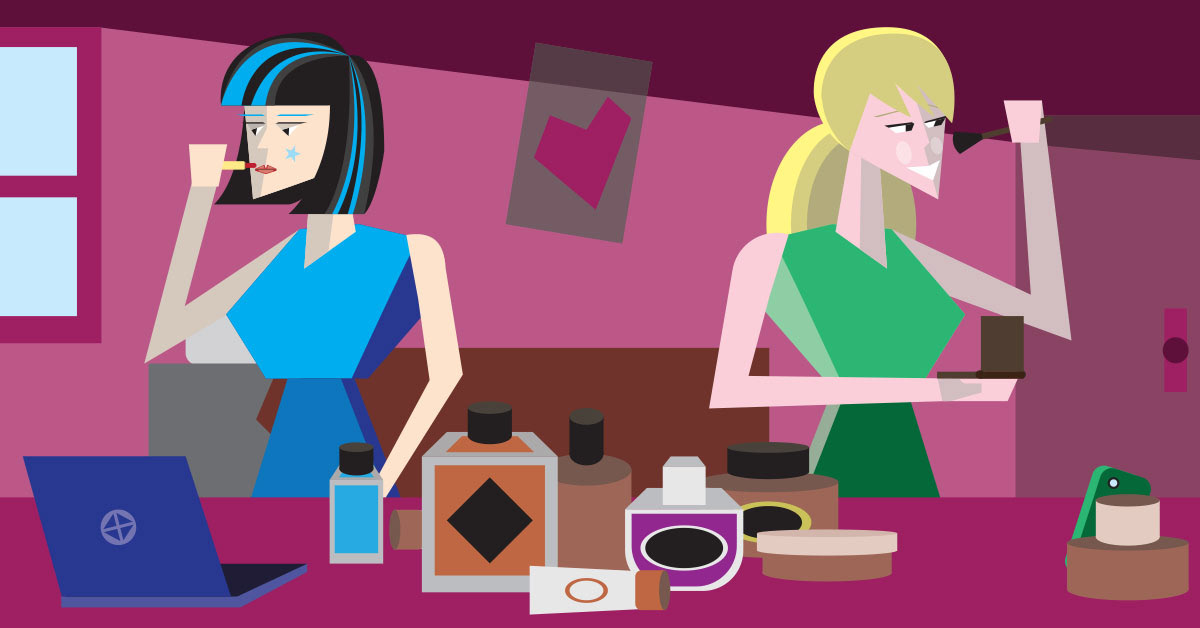
Makeup Gets A Glowup: Thanks To Gen Z
This is an illustration for an article I did about how Gen Z was changing makeup trends thanks to social media. To show how much influence the younger generation has in this area, I tried to show two college girls using different technology to record themselves trying on their makeup. One is using a computer to record themselves while another one uses their phone. I also set the image in a college dorm room painted dark pink/magenta to give it a more "feminine" aesthetic.
Original Article: https://www.trillmag.com/lifestyle/beauty/makeup-gets-a-glow-up-thanks-to-gen-z/
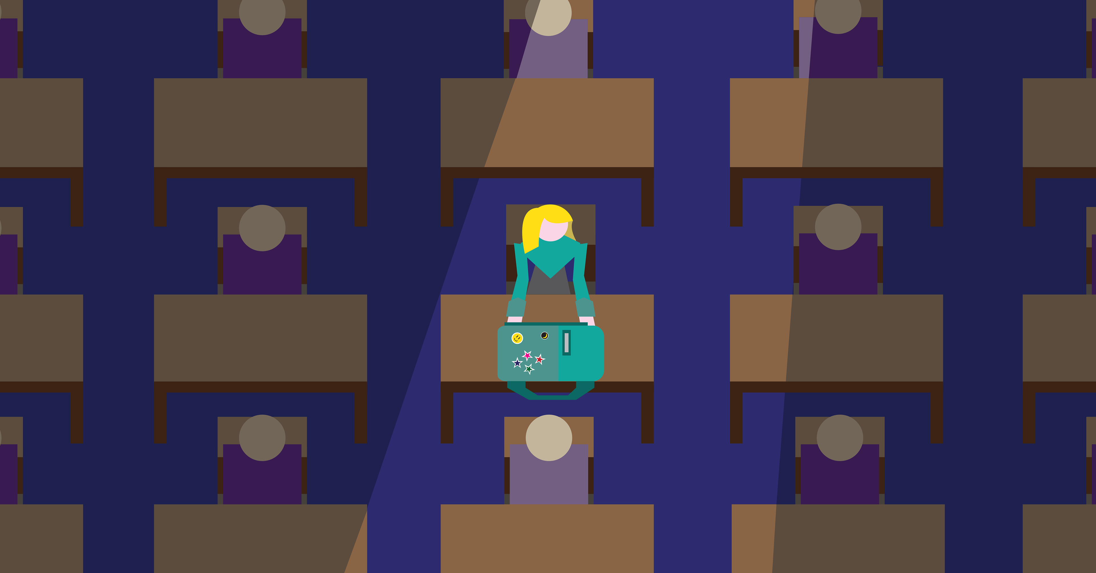
The Interesting Reason Why We Remember Faces But Forget Names
This is a secondary article image I made for an article about how we can forget people's names despite remembering their faces. When creating the composition, my editor requested that I feature a young girl in a classroom with a sticker-covered backpack feeling isolated amongst her classmates. To give the image a greater sense of scale so as to emphasize the loneliness the character feels, I created the illustration as an ariel shot with the aforementioned girl having a light cast down upon her to help identify her from everyone else (who remain mostly in shadow).
Original Article: https://www.trillmag.com/news/science/why-we-remember-faces-but-forget-names/
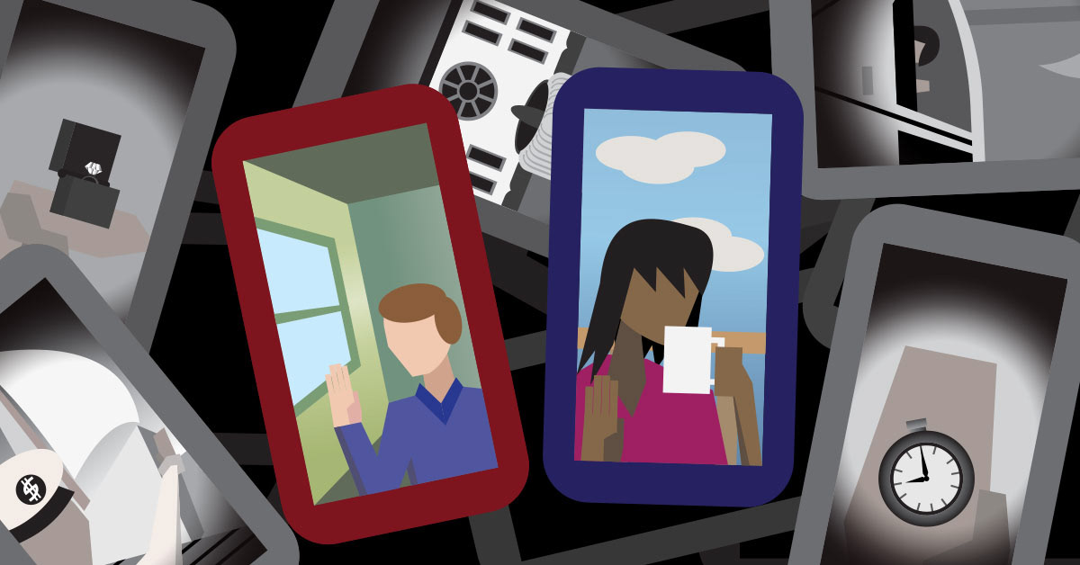
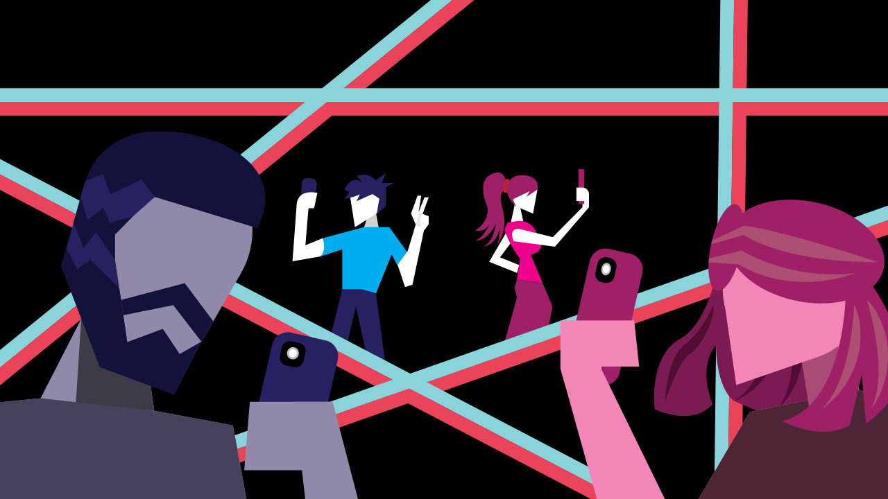
How "Average" Influencers Remind Us Of What Real Living Looks Like
I created this illustration for an article about "average" social media influencers and how they are much healthier than more trendy influencers. For the composition, I wanted to create a stark visual contrast between the "real" and "artificial" lifestyles that are exuded by these different types of influencers. The background features a pile of cellphones in black and white featuring wealthy expenditures that are often flaunted by the rich, more trendy influencers that get the most attention (ex: houses, new cars, trinkets, etc.). In the foreground, I placed two phones featuring an "average" male and female influencer living their average, albeit uneventful, day-to-day life.
Original Article: https://www.trillmag.com/life/how-average-influencers-remind-us-of-what-real-living-looks-like/
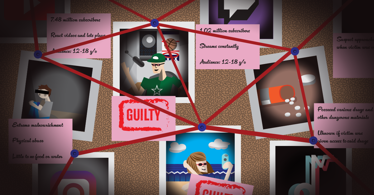
What To Do When Your Favorite Influencer Gets "Cancelled"
I created this illustration for an article about controversial social media influencers and how one should deal with them once word of their scandals becomes public. When creating the illustration, I decided to stage it as an evidence board to visually show how your favorite influencer could be involved with controversial, potentially criminal actions. Rather than calling out a specific, real-life influencer on the board, I instead chose to create two generic influencers (one male streamer and one female poster) to show how much widespread influence these controversial people tend to have.
Original Article: https://www.trillmag.com/life/what-to-do-when-your-favorite-influencer-gets-canceled/
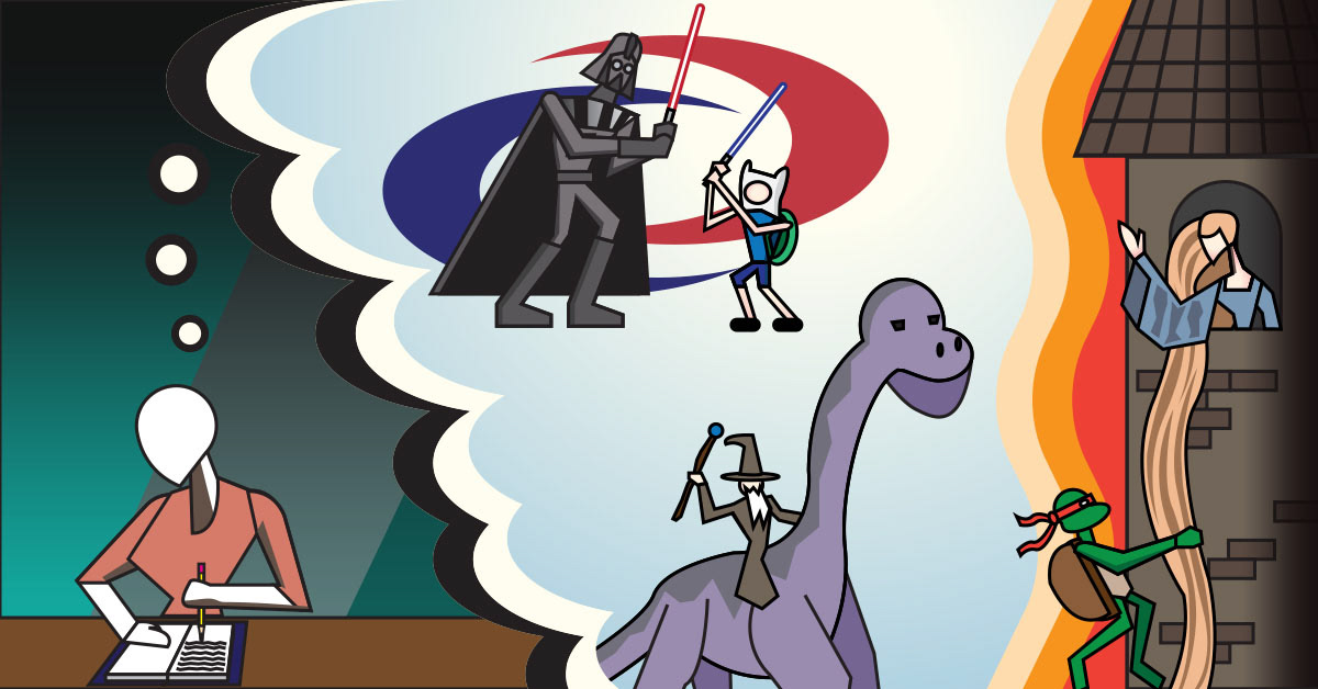
Fanfiction: The Evolution of a Fan's Favorite Pastime
I created this illustration for an article about how fanfiction has evolved with time. I had only a basic idea of the composition when designing this illustration: part of the image should show a person writing their fanfiction, the rest should be a thought bubble showcasing visually what that person is brainstorming. Given the near endless possibilities that fanfiction can allow, it was too difficult for me to depict just one scenario in this illustration, so I included several. Of these scenarios include a lightsaber duel between Darth Vader (Star Wars) and Finn the Human (Adventure Time), Rapunzel (original fairy tale version) being rescued by Raphael (Teenage Mutant Ninja Turtles), and Gandalf (Lord of the Rings) riding a dinosaur. For the illustration's style, I tried to divert away from the solid color, pseudo art deco style that I've incorporated in most of my previous article illustrations and instead try something new with more outlines and defined character forms.
Original Article: https://www.trillmag.com/culture/fanfiction-the-evolution-of-a-fans-favorite-pastime/
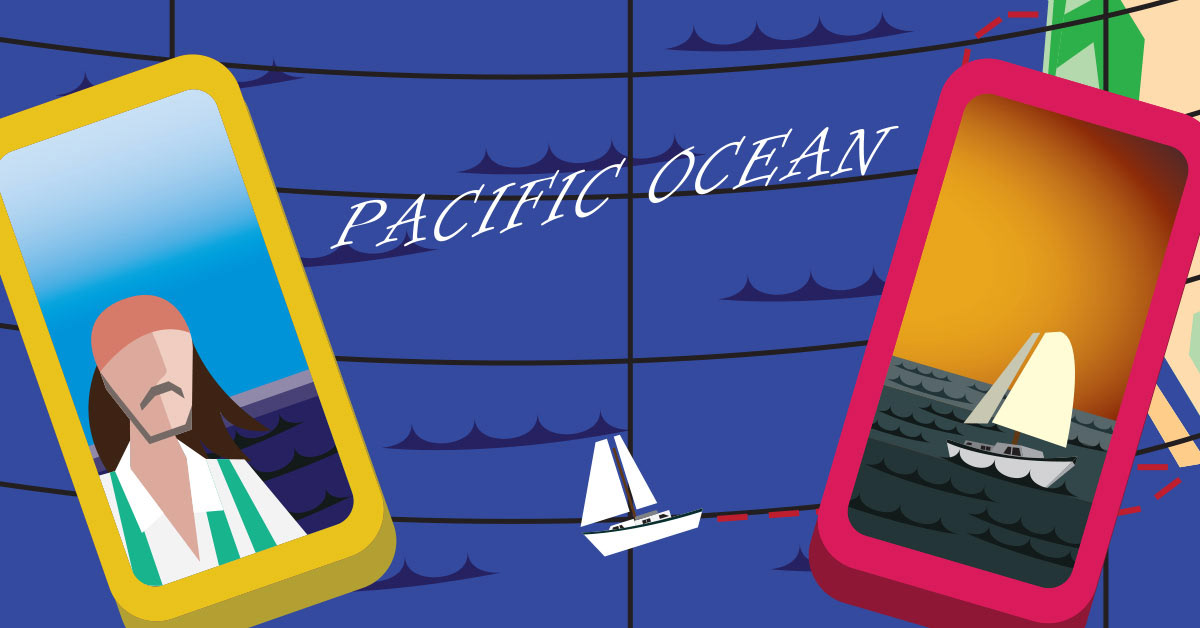
Meet TikTok’s “Sailing Songbird,” the Former Middle School Teacher Crossing the Pacific Ocean on a Sailboat – Alone
I created this illustration for an article about the "Sailing Songbird," a former middle school teacher who has been making waves on social media by posting updates from his solo sailing adventure across the Pacific Ocean. For the image composition, I modeled it after a loose, cartoony map of the Pacific Ocean so that I could visually showcase the Sailing Songbird's trip from the American west coast to the heart of the ocean. I also decided to include two cellphones to cover the map, showcasing an image of both the titular Songbird himself and a rough illustration of the boat he is using for his daring adventure.
Original Article: https://www.trillmag.com/culture/meet-tiktoks-sailing-songbird-the-former-middle-school-teacher-crossing-the-pacific-ocean-on-a-sailboat-alone/
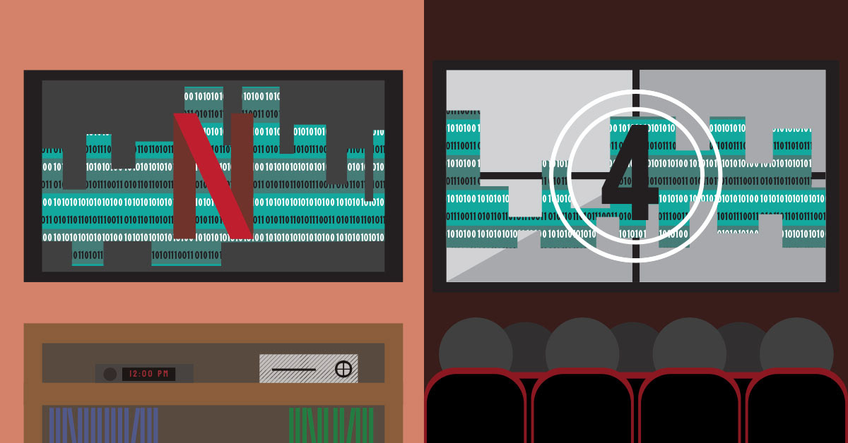
We're Obsessed With Dystopias. Why?
I created this illustration for an article about the use of AI in film and TV production. Originally, I wanted to include visuals that reflected two of the media properties that were discussed in the article's pitch: the TV show Black Mirror and the film Civil War. However, as I refined the illustration, I instead decided to create a more generic composition that exhibited how AI could potentially affect all of film and TV outside of these primary examples. To represent AI, similar to a previous AI-related article I helped work on (see Love Bytes: AI's Takeover of Human Connection Seen in Film), I created a binary code-like pattern effect in Adobe Illustrator which I then applied in various shapes to both the TV and movie theater screen featured in the composition.
Original Article: https://www.trillmag.com/culture/were-obsessed-with-dystopias-why/
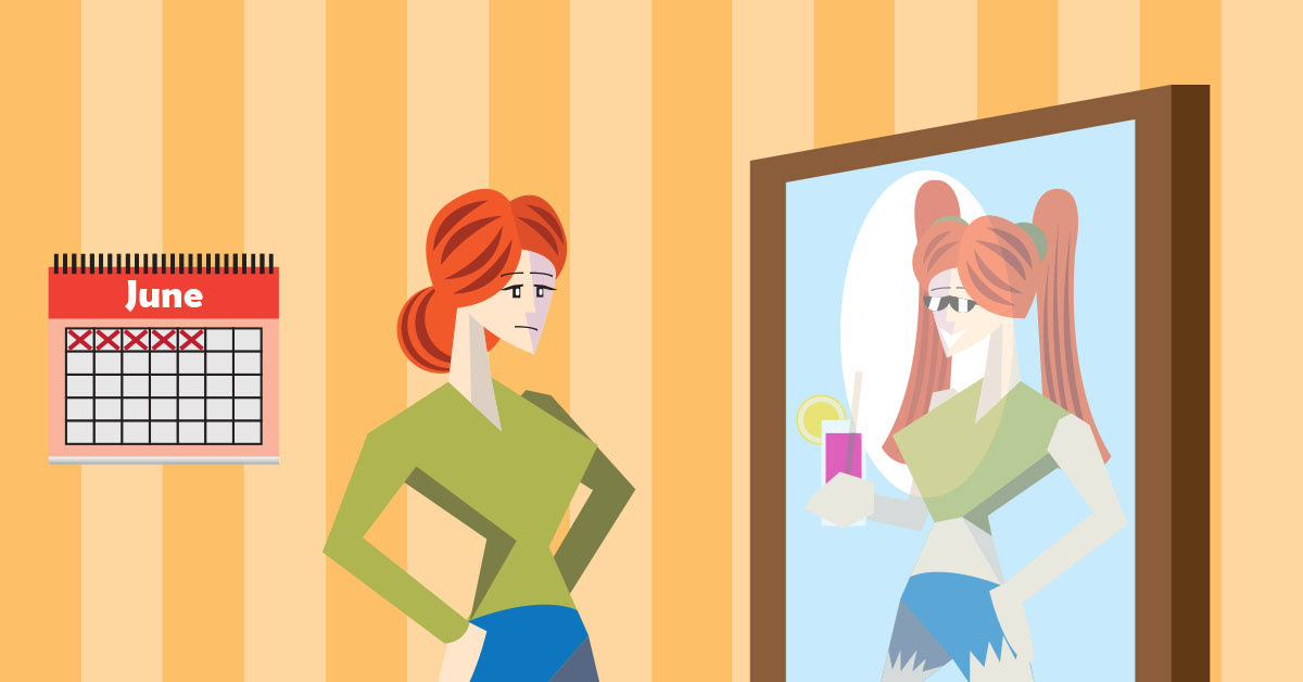
How to Have the Ultimate "It Girl" Summer
I created this illustration for an article providing tips about how women can spruce up their lifestyle this summer. For the composition, I wanted to provide visual contrast between 2 different women. The first is the regular woman before the summer season has begun, looking at her reflection in the mirror. The second woman (i.e. her reflection) is the person she could become if she allowed herself to exit her comfort zone and try new things this summer (ex: new clothes, hairstyles, hobbies, etc.).
Original Article: https://www.trillmag.com/life/social-media/how-to-have-the-ultimateit-girl-summer/
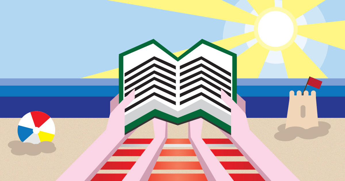
The 10 Best Summer 2024 Books
I created this illustration for an article ranking the top 10 books to read this summer. For the composition, I wanted to create a first-person perspective image featuring a person reading a book while at the beach (a very popular summer destination for many people).
Original Article: https://www.trillmag.com/culture/the-10-best-summer-2024-books/
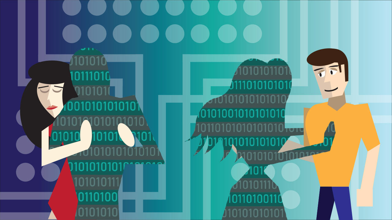
Love Bytes: AI's Takeover of Human Connection Seen in Film
I created this illustration for an article about how AI has been replacing human connection and interaction in recent cinema. The composition features a more generic AI-Human interaction scenario rather than one as described in the original article. Originally, I had intended on creating a female robot character that would interact with a male character while an adjacent female character danced on with said male's silhouette (a visual representation of the missing "human" element of physical interaction). However, as I developed the idea, I instead decided to create silhouettes of a male and female character which I would then overlay with a binary code texture I created before placing them back into the composition.
Original Article: https://www.trillmag.com/entertainment/love-bytes-ais-takeover-of-human-connection-seen-in-film/
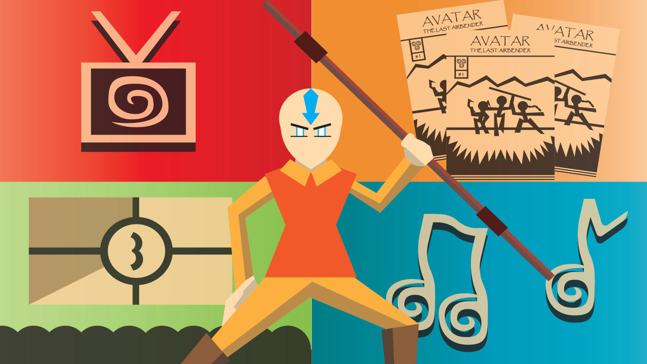
You've Watched Avatar: The Last Airbender - What Now?
I created this illustration for an article discussing the multiple media and events that are tied to the beloved Nickelodeon franchise Avatar: The Last Airbender. Originally, I had wanted to design the composition using a dark red background and the elemental symbols (water, fire, earth, and air) so that I could mimic the intro of the original animated series. Instead, as I developed the illustration, I was encouraged to highlight some of the extra spin-off projects that have either already released or are expected to release in the future. These other projects include various TV shows, films, comic books, and even a live concert. To do so, I divided the illustration into 4 quadrants with each section highlighting one of the aforementioned projects related to the franchise. I also tried to include a swirl-motif in some of these sections to match the visual style of the elemental symbols featured in the series. Aside from this, I also included Aang (the titular "Last Airbender" the series primarily focuses on) in the foreground.
Original Article: https://www.trillmag.com/culture/youve-watched-avatar-the-last-airbender-what-now/
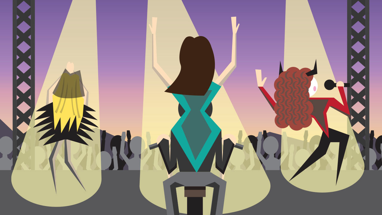
Coachella 2024 Brings Popstar Culture Back
I created this illustration for an article on Coachella 2024 and the return of "popstar culture" that it brought with it. For the composition, I wanted to create a stage setting during the event that would highlight several of the singers that are briefly discussed in the article, along with quirks they have been associated with as part of their career. From left to right, the singers featured are Sabrina Carpenter dressed in her black outfit from her controversial music video "Feather", Lana Del Ray riding on the back of a motorcycle jockey (a common element to her act), and Chappell Roan with her elaborate makeup (or "campy drag aesthetic" as described in the article).
Original Article: https://www.trillmag.com/culture/coachella-2024-brings-popstar-culture-back/
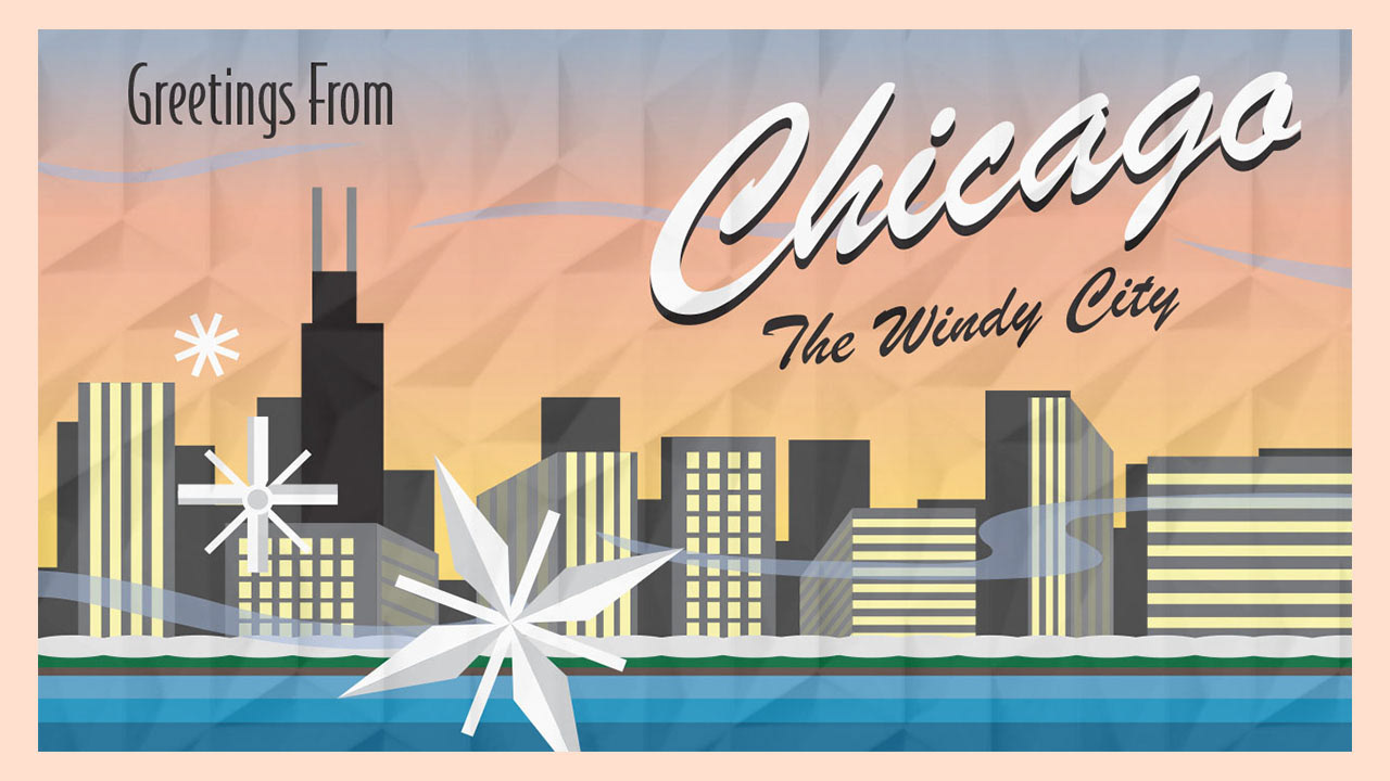
Must-Visit Places in Chicago
I created this illustration for an article that discussed the best places to visit in Chicago during the winter. For the composition, rather than highlighting potential food or entertainment venues found in the city, I instead decided to design the illustration as a post card featuring the Chicago skyline so as to emphasize the travel/tourist aspect of the article. This way, it would be as if the author was sending this card to the viewer as a way to say "wish you were here." I also added in the snowflakes, snow, and wispy clouds/wind to make the city look like it's in the middle of winter (the author had visited the city during December).
Original Article: https://www.trillmag.com/life/travel/must-visit-places-in-chicago/
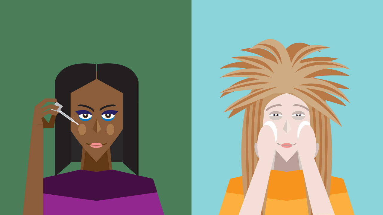
8 Of The Best Spring 2024 Beauty Trends
I created this illustration for an article on beauty trends for the 2024 spring season. For the composition, I tried to incorporate all of the main beauty trends that the article discussed into a single image (ex: 80s big hair, colorful makeup, etc.). Originally, I had wanted to incorporate all of these trends onto a single person, but I instead decided to split the different trends amongst two different people to make it easier.
Original Article: https://www.trillmag.com/lifestyle/beauty/8-of-the-best-spring-2024-beauty-trends/
The ‘90s Babies Look Younger’ Trend: A War Between Millennials And Gen Z
This illustration was made to accompany an article about how the '90s Babies Look Younger' trend found on social media. For the layout, I used a black background overlaid with the outline of a star so as to highlight the fleeting fame these people try to find on social media. The star and background are colored in black, pink and blue, a subtle reference to the social media platform TikTok. As for the figures, I wanted to highlight the reality that many of these 30-year old social media users refuse to accept (i.e. that they aren't as young as they once were). The foreground features a man and woman (in both blue and purple/pink respectively) while the background shows the ideal younger selves they see themselves as.
Original Article: https://www.trillmag.com/culture/the-90s-babies-look-younger-trend-war-between-millennials-and-gen-z/
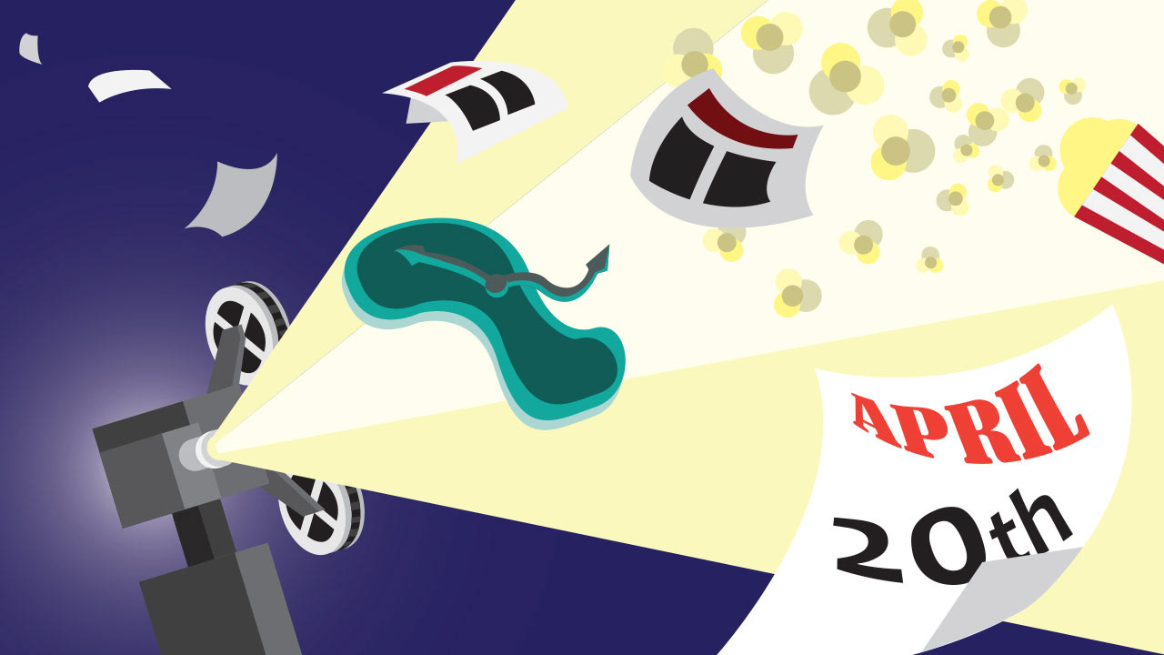
6 Surreal Movies to Watch this 4/20
I made this illustration to accompany an article listing surreal movies that would be perfect to watch on April 20th (abbreviated as 4/20 in article title). For the composition, I opted to make a more generic, surreal background that utilized different film aspects (i.e. the popcorn and projector), along with a calendar that represented April 20th. The warped green clock is a reference to Salvador Dali's surrealist masterpiece Persistence of Memory.
Original Article: https://www.trillmag.com/entertainment/tv-film/6-surreal-movies-to-watch-this-4-20/
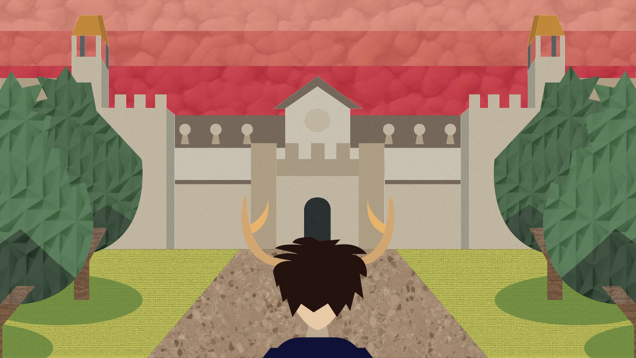
The Real Saltburn? Oxford Students Are Saltburnt Out
This illustration was made to accompany an article reviewing the movie Saltburn. I based the main composition of the image off of a brief landscape scene featured in the film (i.e. when the main character arrives at the titular Saltburn location where the film is set). I then lowered the perspective of the scene to make it look like the reader was peering right behind the main character's head as he looks onto the university building that makes up the titular location. Since this movie is supposed to be more of a psychological thriller, I decided to give the sky shades of red in order to make it look more menacing. I also added texture effects to the sky, grass, pathway, trees, and buildings so as to give the composition more depth and surrealist feeling.
Original Article: https://www.trillmag.com/entertainment/tv-film/the-real-saltburn-oxford-students-are-saltburnt-out/
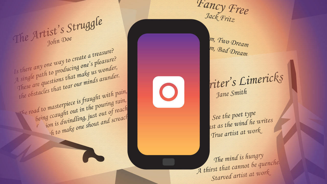
Should We Recognize Insta Poetry During National Poetry Month?
This illustration was made to accompany an article on National Poetry Month, specifically regarding whether the trend of 'Insta Poetry' (i.e. poetry published on Instagram) should be recognized as actual poetry. I wanted to have this composition highlight the technological divide between the old and new ways of creating poetry. For the background, I made up several rushed poems which I then placed onto rectangular shapes which I then scattered across the screen like pieces of paper. I also added in some quill pens so as to make it look like these were actually handwritten. I then added a phone in the foreground with a colored gradient screen and simple camera logo so that I could replicate the Instagram logo. I also added a gradient to help visually highlight the divide between handwritten work and digital works (appropriately also in the Instagram colors).
Original Article: https://www.trillmag.com/culture/insta-poetry-national-poetry-month/
Why is Dating in College *So* Difficult?
I made this illustration for an article about the difficulties of dating in college. The article originally had a stock illustration of a generic heart pattern, but the editors were looking for something that more directly related to the article. For the composition, I decided to showcase two college students, one male (blue) and one female (red/pink), looking anxiously at one another with a pair of question marks in between them to tie everything into the main message of the article. I also colored the question marks and gave them hearts to further highlight this.
Original Article: https://www.trillmag.com/life/college/the-difficulty-of-dating-in-college/

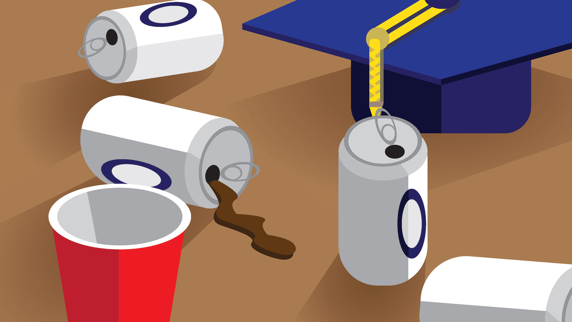
Beyond The Buzz: How To Find A Healthy Drinking Balance In College
This was the first illustration I completed as part of the internship. As a warmup, we were instructed by our supervising editor to choose an existing article on the website and design a new editorial illustration to accompany it. For my illustration, I choose an article that dealt with how to control your drinking habits while in college. For the composition, I chose to depict a tabletop scene with assorted beer cans and a red solo cup to visually imply what bad drinking habits can look like, I also included the graduation cap in the back to make it obvious that the article was specifically focused on college-aged drinkers.
Original Article: https://www.trillmag.com/life/college/beyond-the-buzz-healthy-drinking-in-college/
Video Thumbnails
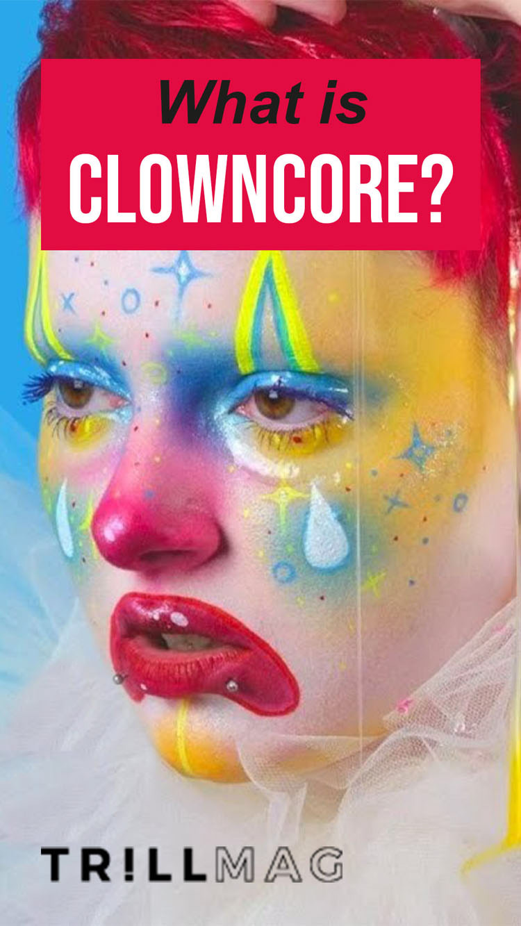
TikTok/Reels Thumbnails
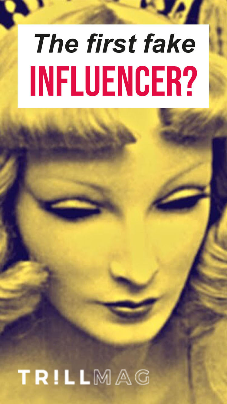
During my internship, I was asked to edit several pre-existing video thumbnails so that they could be exhibited on social media platforms like TikTok and Instagram Reels. While I did not design the original thumbnails, I did add in the extra text featuring the video's title (ex: "What is Clowncore?"), along with the official Trill Mag watermark.
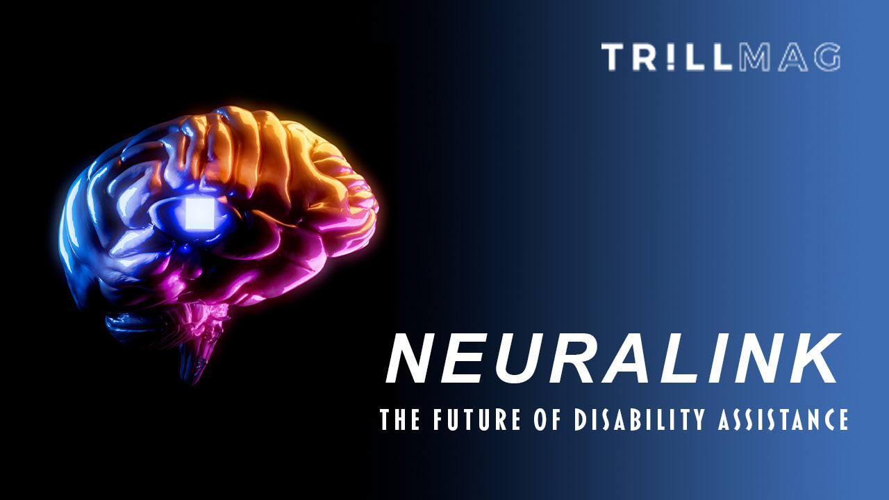
Could Elon Musk’s Neuralink Be A Game-Changer For People With Disabilities?
I created this thumbnail to accompany a video about Elon Musk's Neuralink and how it could potentially help people with disabilities. For the layout, I utilized an image from a demonstration of the technology (sourced from Shutterstock) and added a thumbnail title (Neuralink: The Future of Disability Assistance) in a typeface similar to the official Neuralink logo and branding. Originally, I intended to use a solid black background to match the image I used, but I later added a gradient to the background so as to give the thumbnail more visual contrast.
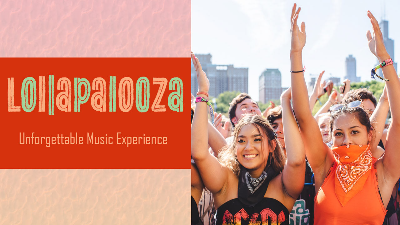
Lollapalooza: Unforgettable Music Experience
I created this thumbnail to accompany a video about the music festival Lollapalooza. For the layout, I decided to split the image in half. On the left half features the title of the video, along with a textured background of my own creation. I also created a mock "Lollapalooza" logo using existing type provided by my Adobe subscription as I was unsure whether I would be allowed to use the official logo in the thumbnail or not. On the right half features a stock image from a previous Lollapalooza concert that I had sourced from Shutterstock.